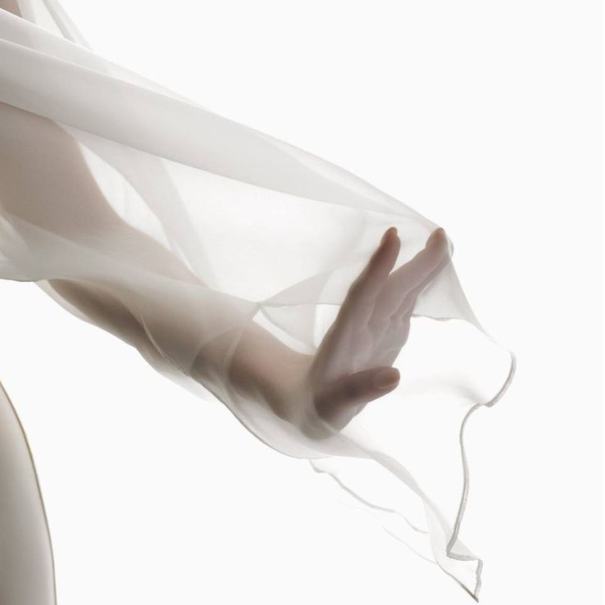
This year, the Pantone Color of the Year ventures into bold new territory with a shade never before announced—a sublime white that embodies the calm everyone craves in an accelerated society: PANTONE 11-4201 Cloud Dancer.
More than just a chromatic choice, Cloud Dancer is a cultural statement. It is a tone that creates space, both physical and mental, for creativity to breathe and for new ideas to take shape, especially within interior design.
Discover the meaning behind the selection of the 2026 Pantone Color of the Year and how Cloud Dancer is inspiring a new way of living.
-
- Espaço físico e mental
-
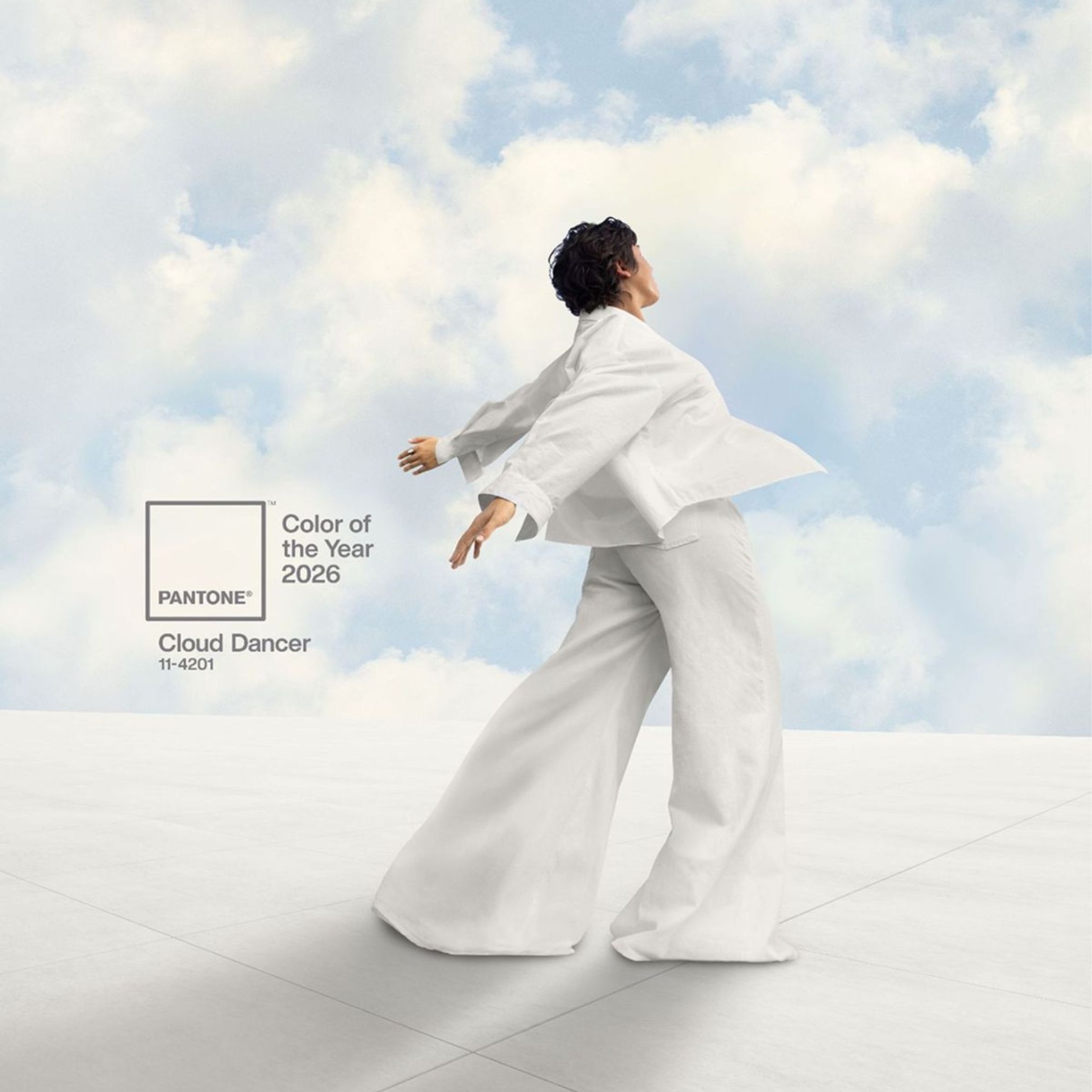
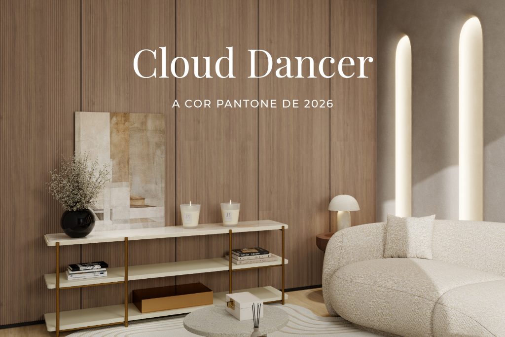
- Cloud Dancer | Fonte: Pantone
-
- Uma Oportunidade para Explorar Novas Ideais | Fonte: Pinterest
A Whisper of Tranquility Amidst the Modern Hustle
The Color of the Year is born from a careful reading of the times we live in. Created by the Pantone Color Institute, this program does more than just identify visual trends; it seeks to interpret the emotional, social, and cultural state of the world through color.
During the selection process for the Pantone Color of the Year, it became clear that we are moving through a transitional period marked by exhaustion from excess and constant acceleration, which intensifies the search for moments of pause. In this context, PANTONE 11-4201 Cloud Dancer emerges as a response to a collective desire to slow down, offering a sense of lightness and space—both physical and mental—to breathe and recenter.
“Similar to a blank canvas, Cloud Dancer signifies our desire for a fresh start. Peeling away layers of outmoded thinking, we open the door to new approaches. An airy white hue, PANTONE 11-4201 Cloud Dancer opens up space for creativity, allowing our imagination to drift so that new insights and bold ideas can emerge and take shape.”
Laurie Pressman
Vice President, Pantone Color Institute
Cloud Dancer is a true breath of fresh air, subtly light, yet also daringly provocative. Essentially, it is a symbol of a new era seeking the delicate balance between an increasingly digital future and the primordial need for human contact.
-
- Sala de Estar
How Cloud Dancer Inspires Design Trends
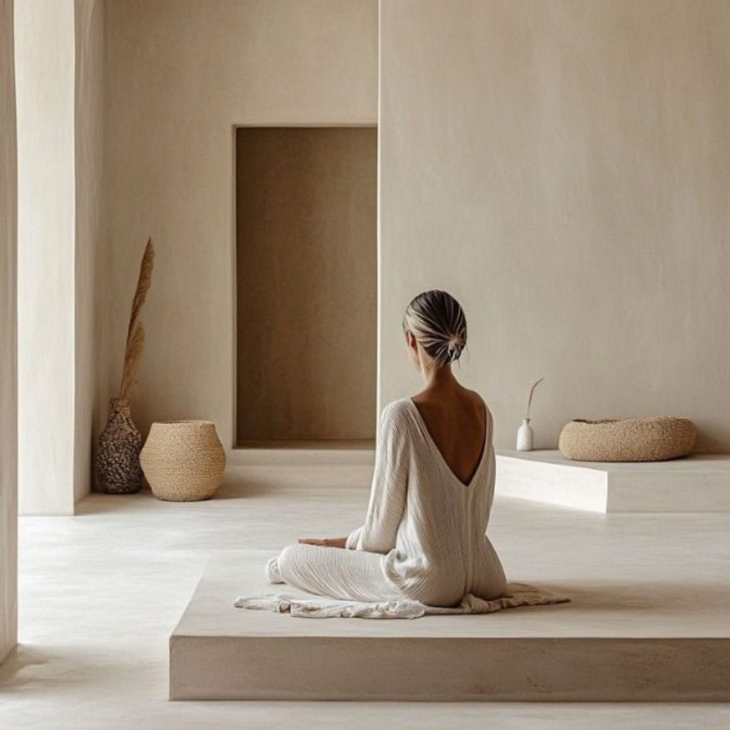
This shade establishes itself as a fertile “liminal space” where new ideas and ways of living can emerge. With its expansive presence, it invites the creation of environments where function and emotion intertwine, building atmospheres of openness and visual clarity that inspire well-being and lightness.
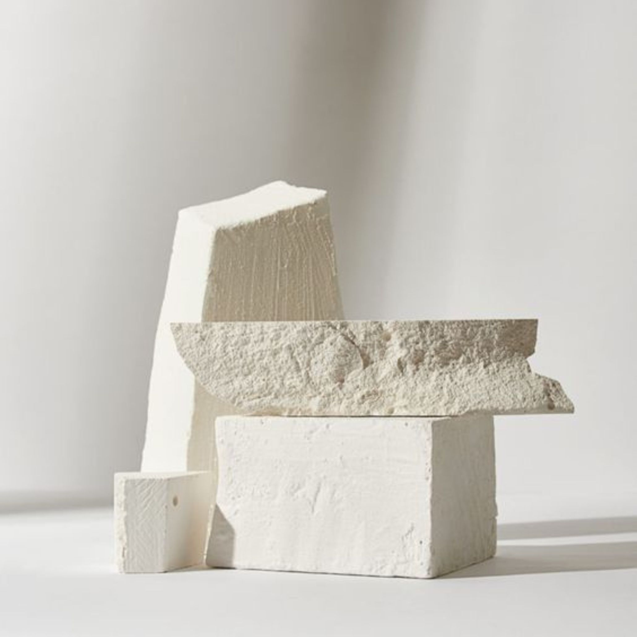
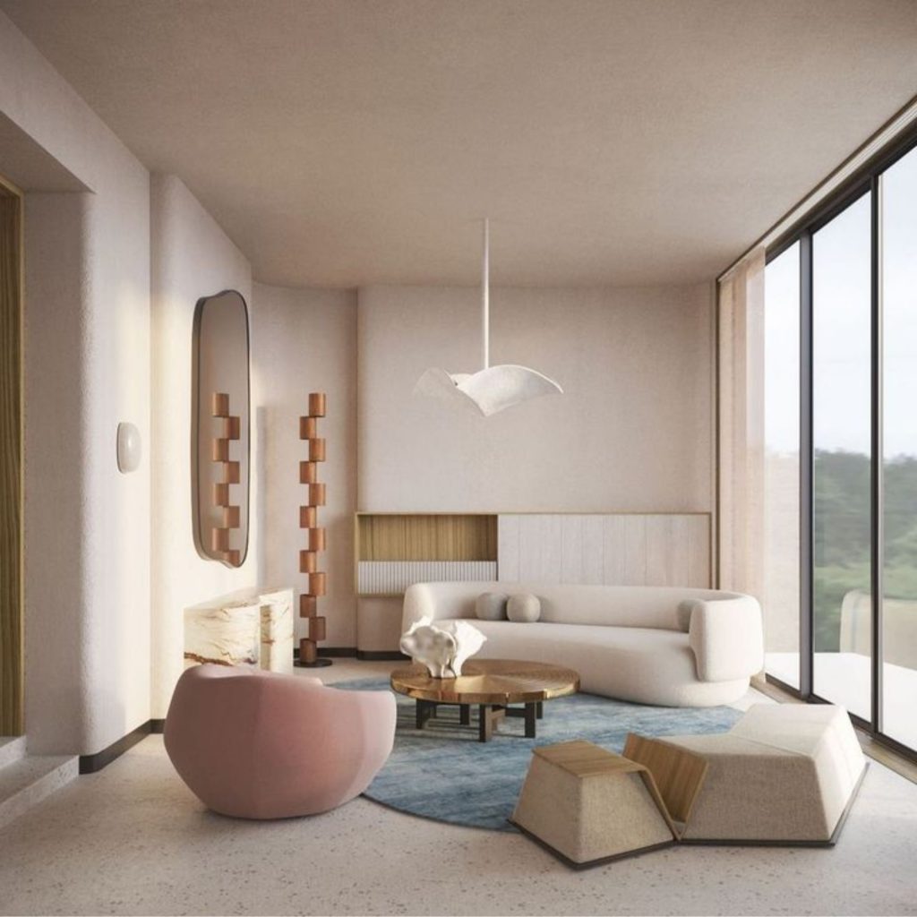
Cloud Dancer influences contemporary design by asserting simplicity as a conscious and sophisticated gesture. Its ethereal and luminous nature responds to the need for calmer, more emotionally balanced spaces where excess gives way to clarity. In interior design, this tone serves as a structural foundation, highlighting materials, shapes, and textures, and allowing other colors to express themselves with greater intensity.
Versatile and timeless, the Pantone Color of the Year adapts to both minimalist environments and more expressive approaches, creating contrast without feeling heavy and harmonizing different visual languages. By promoting an aesthetic of lightness, visual silence, and intention, it inspires trends centered on well-being and fosters a more human relationship with spaces and objects where design is not just seen but felt.
-
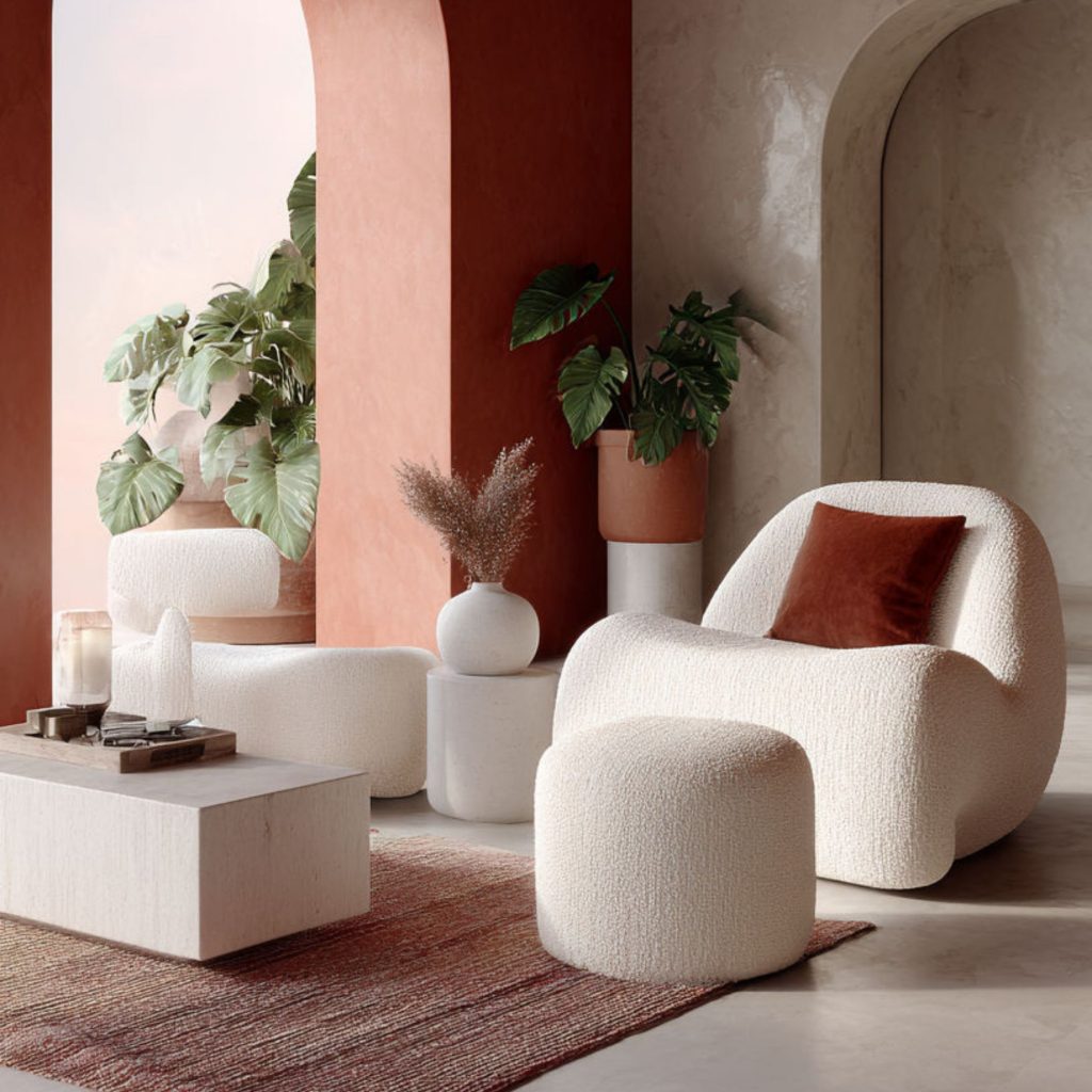
- Cloud Dancer Inserido num Ambiente Expressivo | Fonte: Pinterest
-
- Ambiente Calmos e Emocionalmente Equilibrados | Fonte: Pinterest
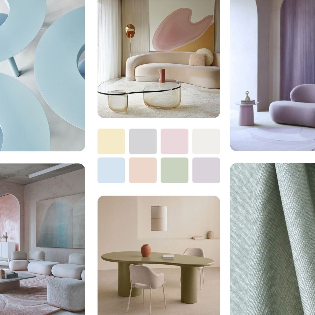
Color Palettes Compatible with Cloud Dancer
While the Color of the Year can stand on its own, it can also be paired with various shades. With this in mind, the brand presents a set of palettes that expand Cloud Dancer’s expressive potential, reinforcing its role as a structural color and an element of chromatic balance.
Powdered Pastels: This palette favors soft, luminous shades, creating discrete and pleasant chromatic variations.
Take a Break: Composed of colors inspired by refreshing flavors and sensations, this palette possesses a light, relaxed energy, resulting in a casual and spontaneous combination.
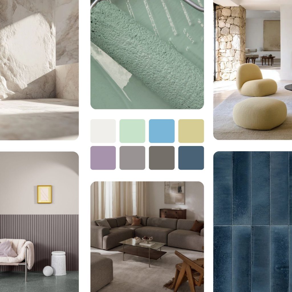
Atmospheric: When placed within this palette, Cloud Dancer ascends to an ethereal dimension, making room for light, airy blues crossed with watery, blue-green nuances.
-
- Powdered Pastels Moodboard | Fonte: Pinterest
-
- Cloud Dancer Conjugado com Tons Pastel | Fonte: Pinterest
Comfort Zone: Natural and organic colors envelop Cloud Dancer in a cozy and inclusive way, creating environments designed to unplug, relax, and regain emotional balance.
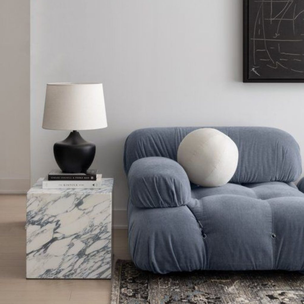
Light & Shadow: Here, Cloud Dancer merges harmoniously with soft tones that evolve into deeper shadows, creating natural and elegant contrasts where the transition between light and depth happens naturally.
-
- Cloud Dancer Conjugado com um Azul-Acinzentado | Fonte: Pinterest
-
- Light and Shadow Moodboard | Fonte: Pinterest
Tropic Tonalities: Inspired by the vibrant energy of the tropics, this palette combines intense, luminous colors – evoking the ocean, lush vegetation, and sunlight – balanced by the light, vaporous presence of Cloud Dancer.
Glamour & Gleam: In this palette, white meets black and intense red, complemented by sophisticated tones like burgundy, teal, and graphite, all enriched by soft metallic finishes.
-
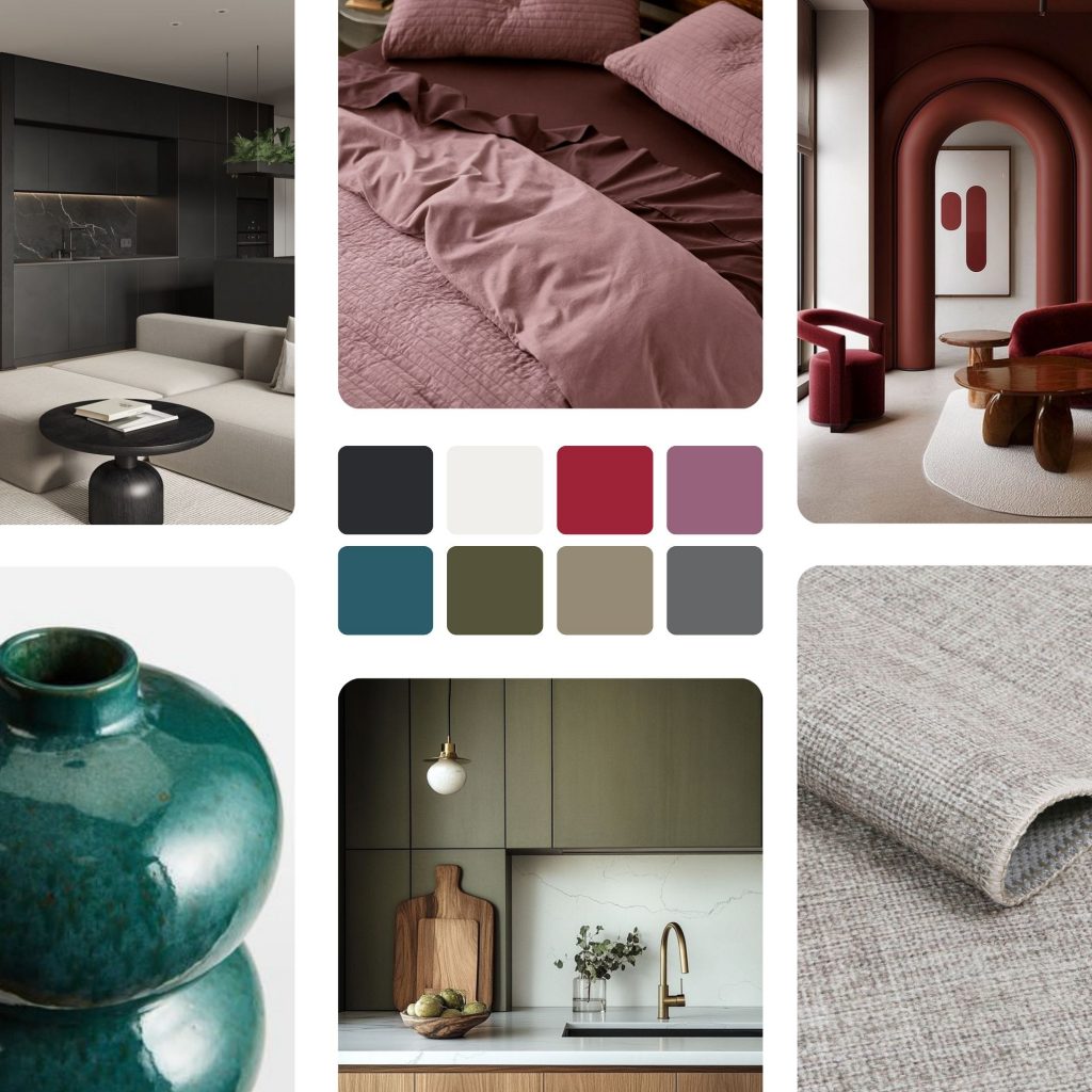
- Glamour & GleamMo
-
- Cloud Dancer Utilizado para Harmonizar Tons Escuros | Fonte: Pinterest
Cloud Dancer is not one of those shades that appears one year and disappears the next. It is a white with presence, adapting naturally without losing its identity, even as trends shift. In an age dominated by excess, this shade functions as a deliberate gesture of simplification, giving us back our focus and a rare sense of space.
Therefore, more than just being “the color of the year,” it is an elegant choice that invites us to slow down, recenter, and reimagine the future with more lightness.