What a year at Jota Barbosa Interiors… 2022 has exceeded all expectations placed on it. Throughout this year, we could make many of our clients’ inspirations come true and give them interiors with the purpose of being “home”. Nothing else made us happier.
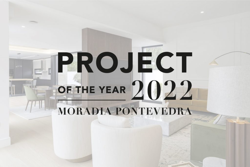
Finished a year with more than 7 projects photographed and successfully completed, we highlight the Pontevedra Villa Project for Project of the Year 2022. A house that surprises us in every nook and cranny, designed to let the freedom of children’s joy live, is now the highlight. Find out all the reasons why we highlight this interior design.
Complexity of the execution of the project
A project that stood out to the eye of interior design connoisseurs, the Pontevedra House Project resulted from the combination of several challenging factors that, with solutions to match, materialized a mastery of design. The main objective was to take advantage of the primary characteristics of the space, highlighting its best qualities and exploring every possible angle.
The natural beauty of the environments exceeded all expectations and it was with this starting point that we began a project with a well aligned and organized architecture, a resplendent natural light, inserted in a housing context of aesthetic excellence. The focus was to underline and make the best of all these elements and from there the inspirations came.
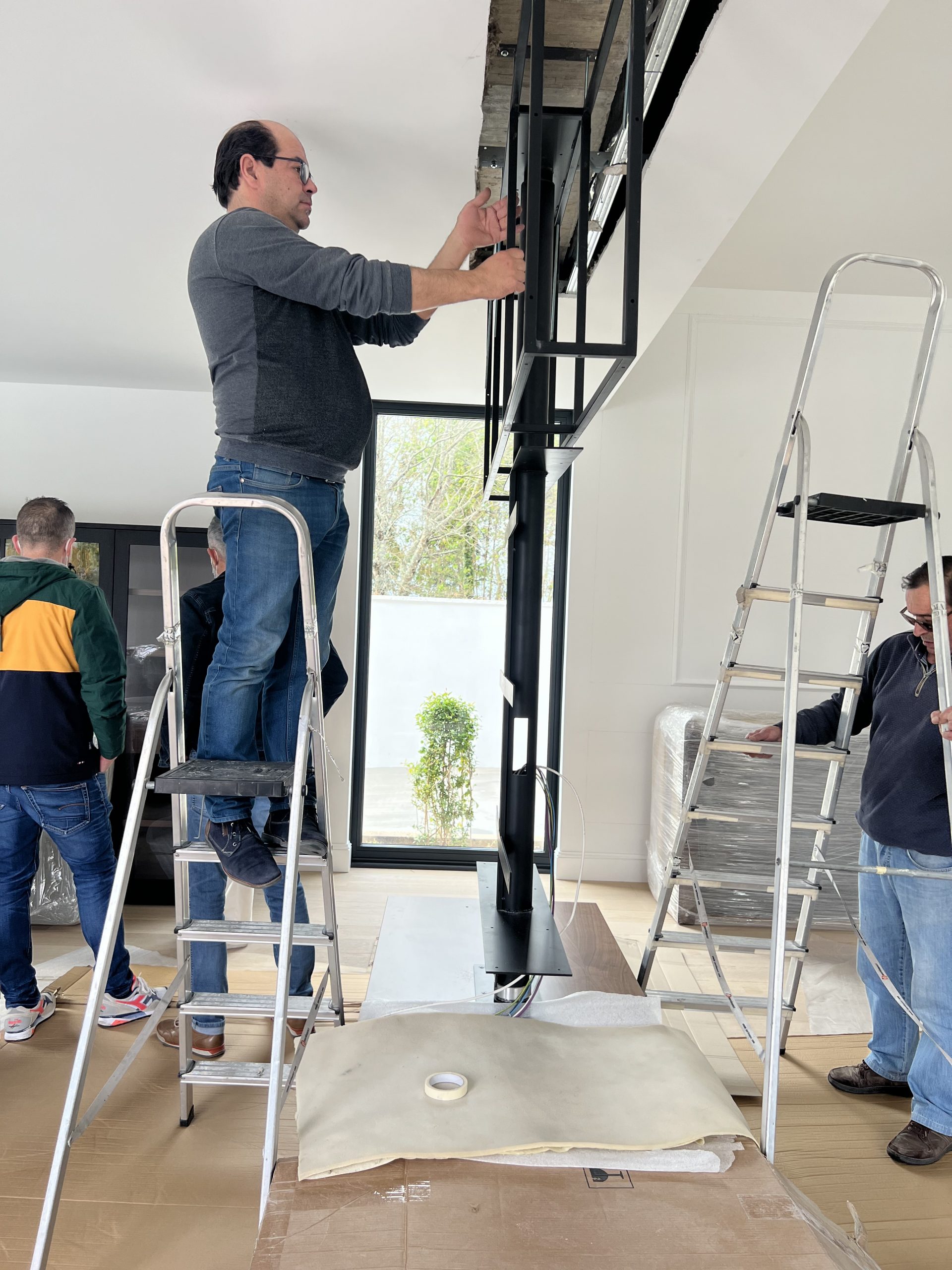
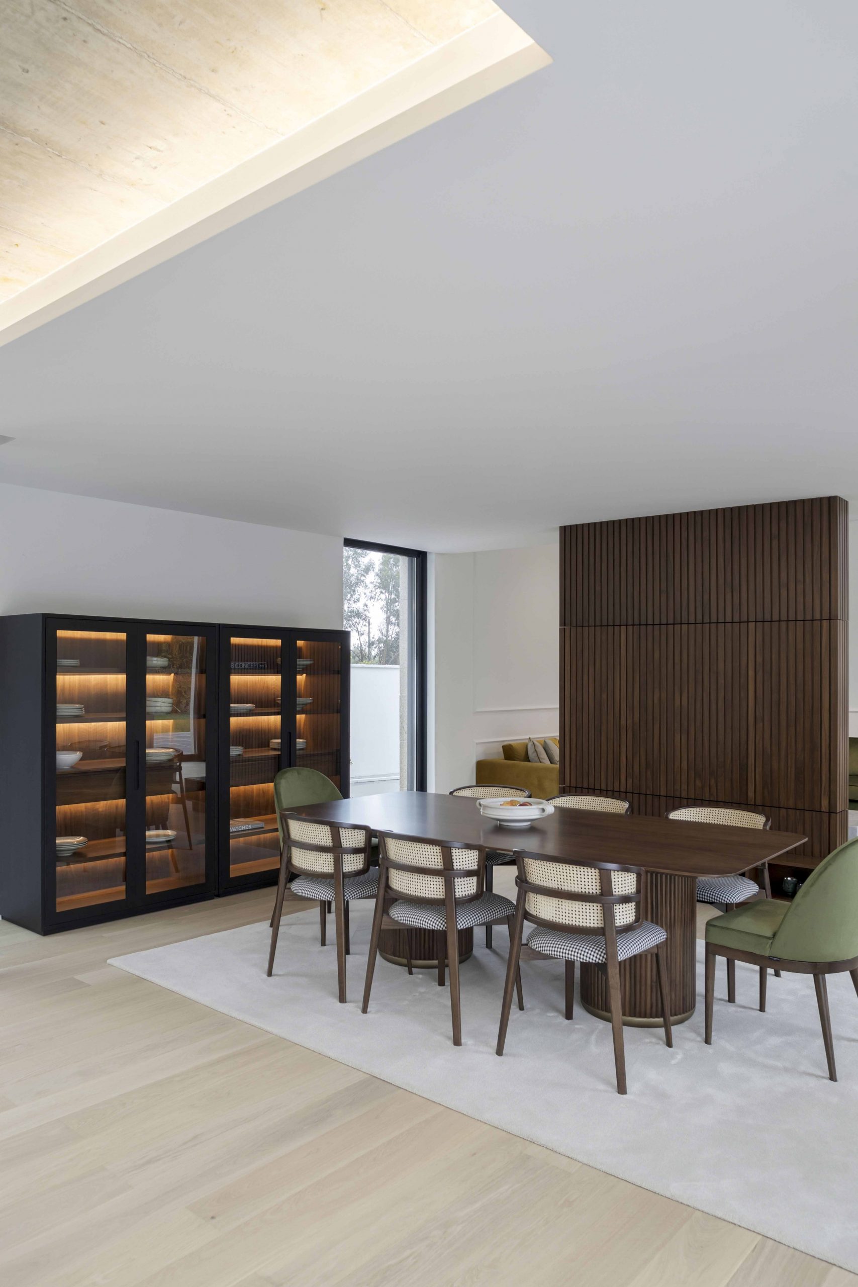
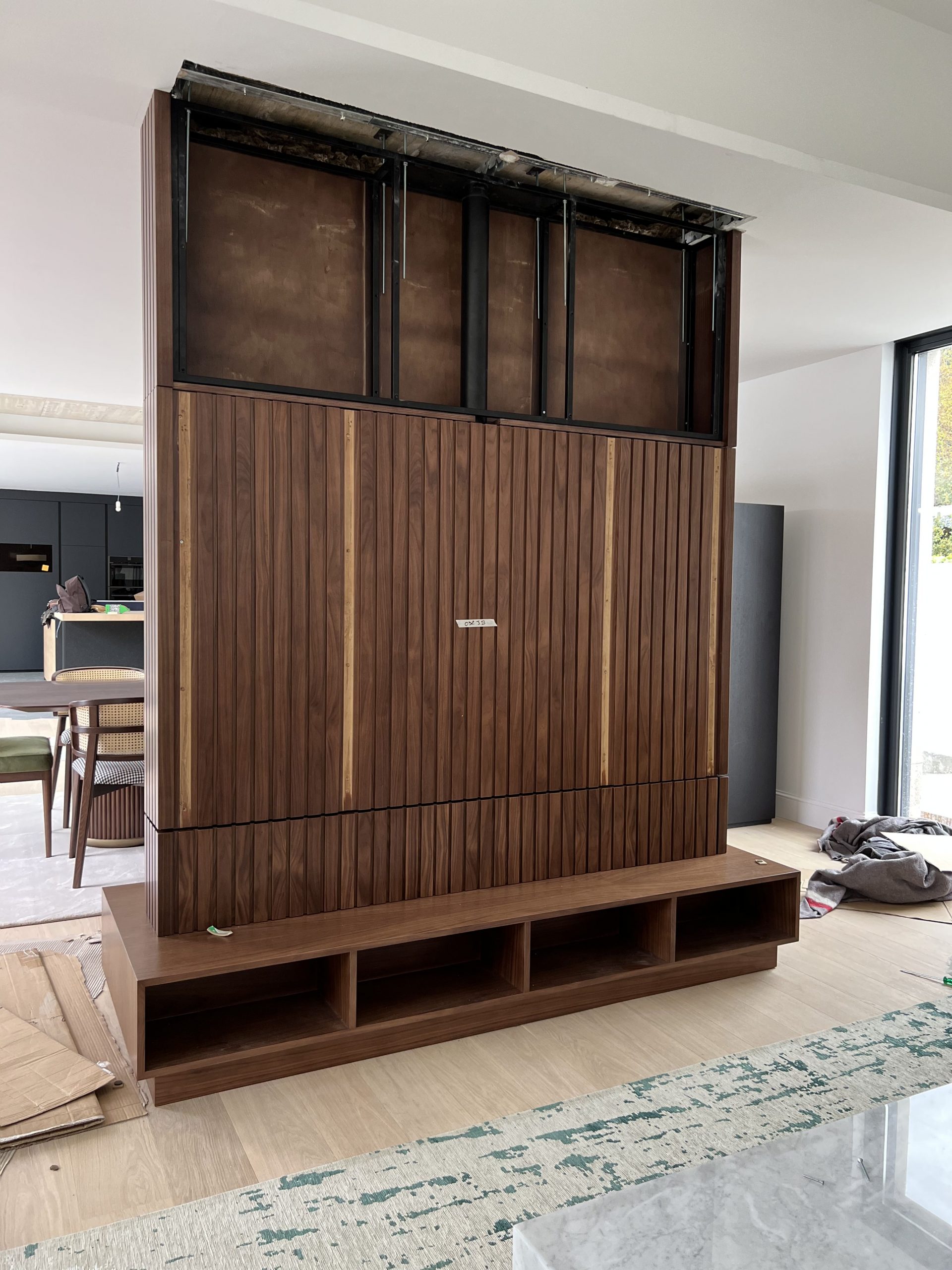
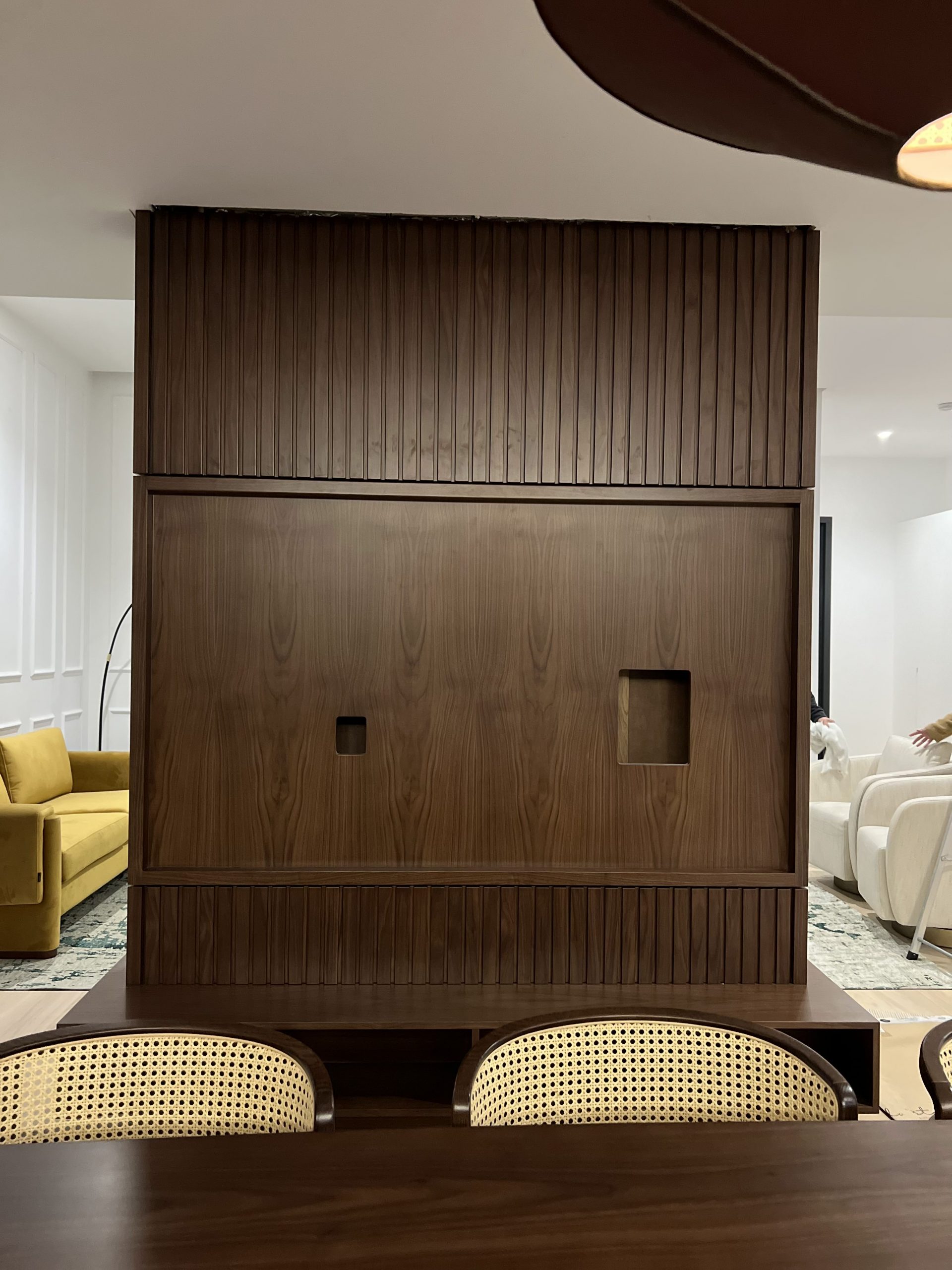
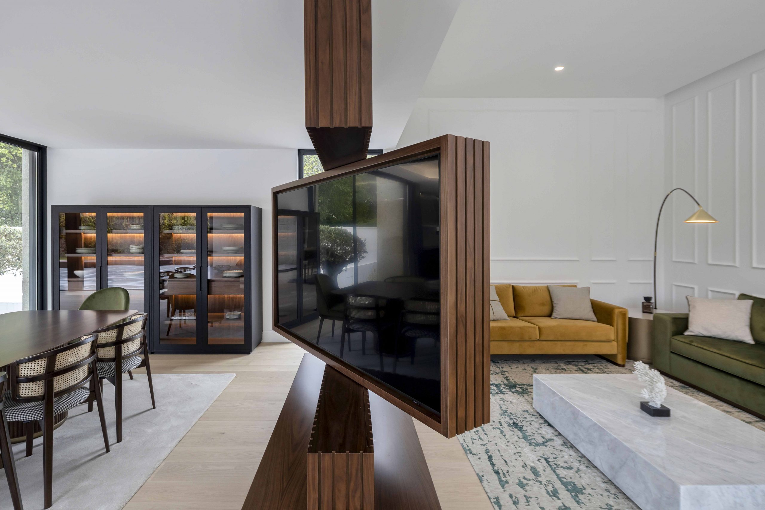
The demand and complexity of this project comes from the customization of a rotating TV furniture, which moved to the dining room as well as to the living room, in order to divide these two areas. Versatile, multifunctional and adapted to the interior conditions, this piece comes to demonstrate a dissimilar solution of all that the market has to offer and it is in this gap that Jota Barbosa distinguishes itself.
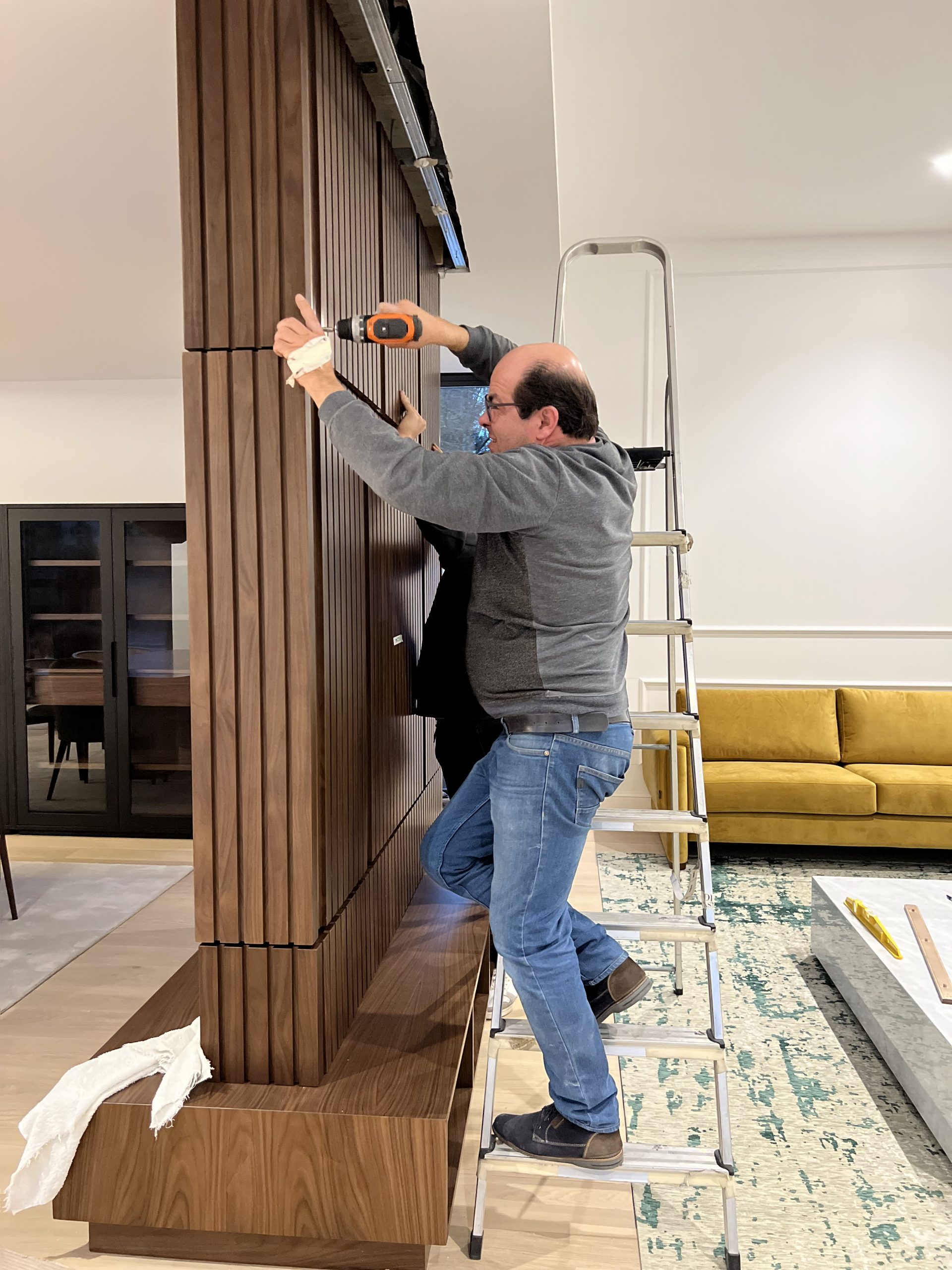
- Pre-assembly of the rotating workpiece installation
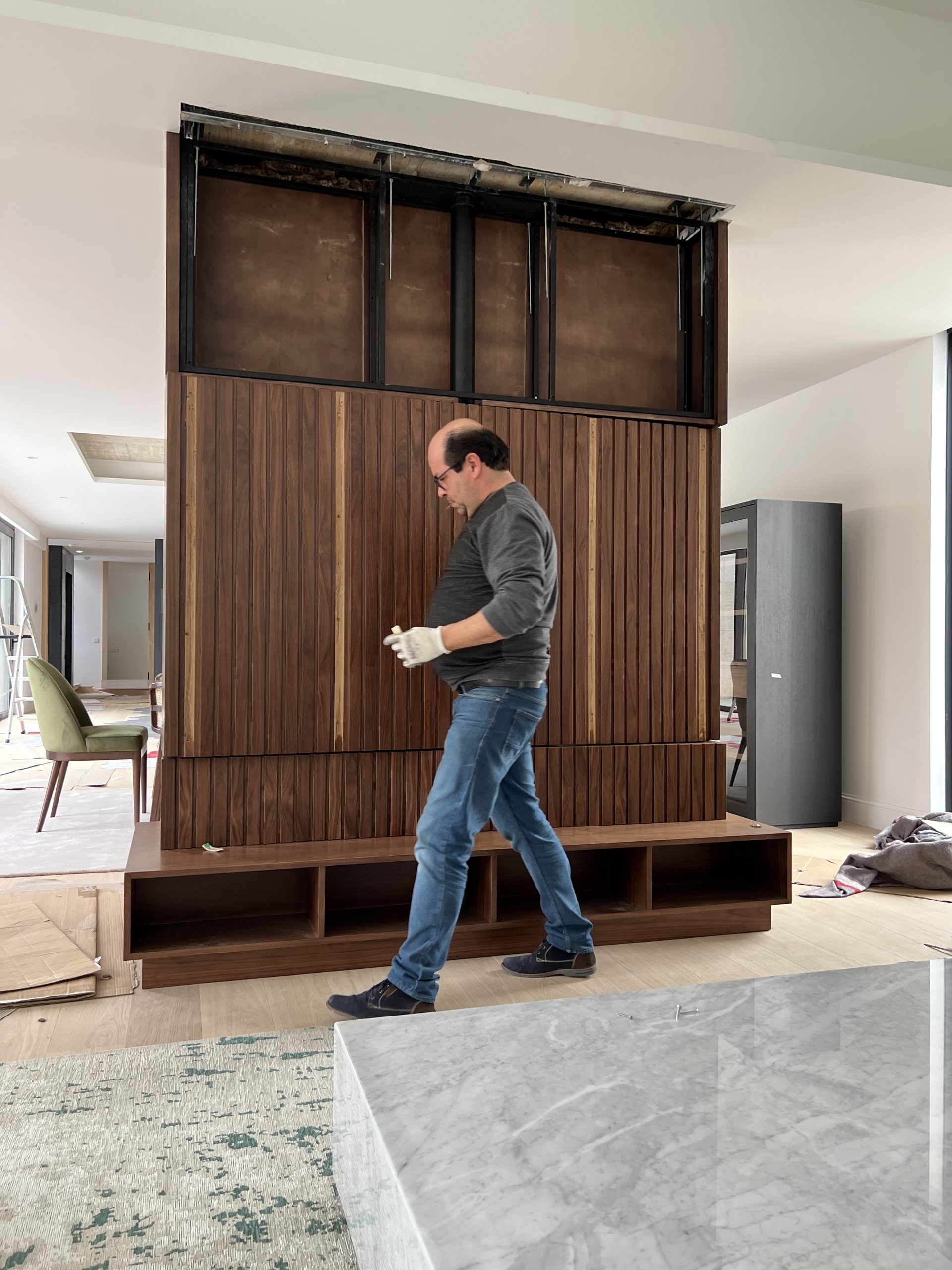
- Customized tv cabinet installation
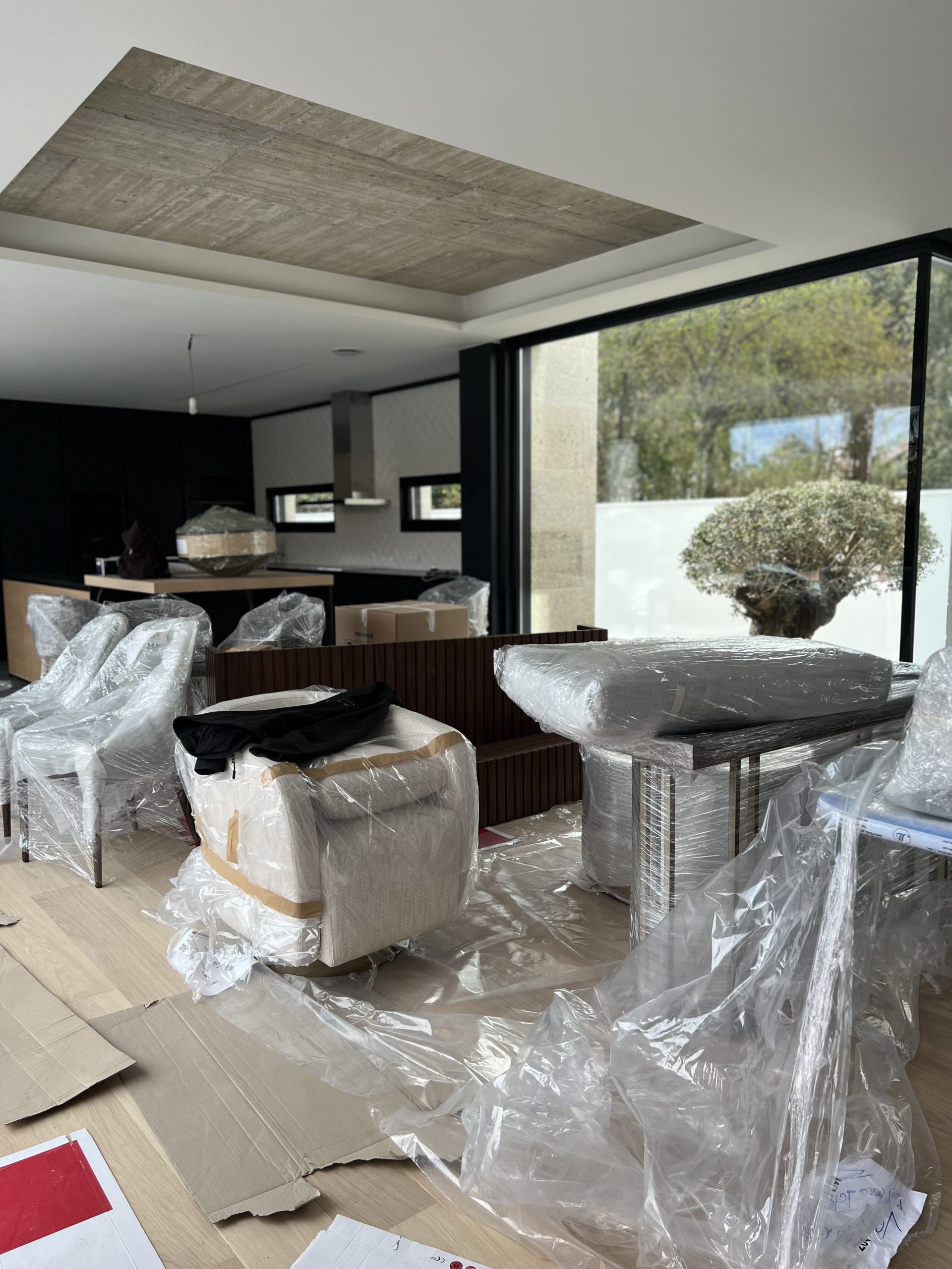
- Assembly and installation of furniture pieces
Choice of Interior Design style
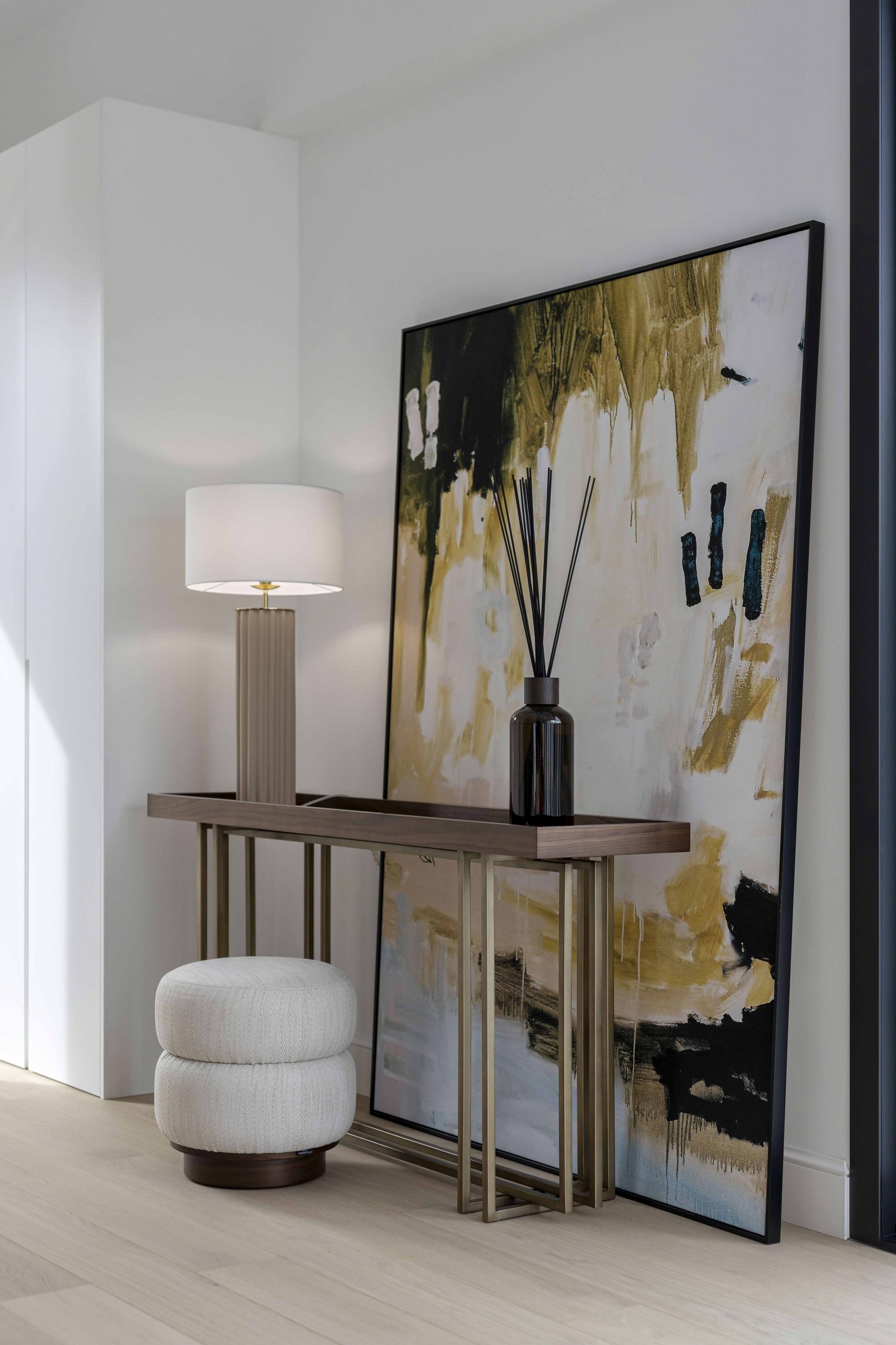
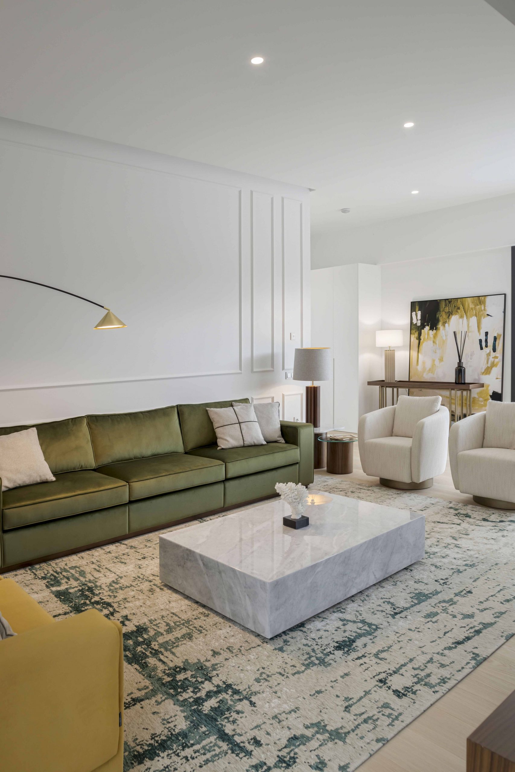
The interiors of the Pontevedra Villa Project signify true eclectic taste, a style that brings together the best of each style, raising the best that each has to give. The pieces swung between Scandinavian and contemporary style, keeping all the rooms with plenty of personality and colour, with the furniture giving priority to the comfort of the children at the same time as a differentiated touch.
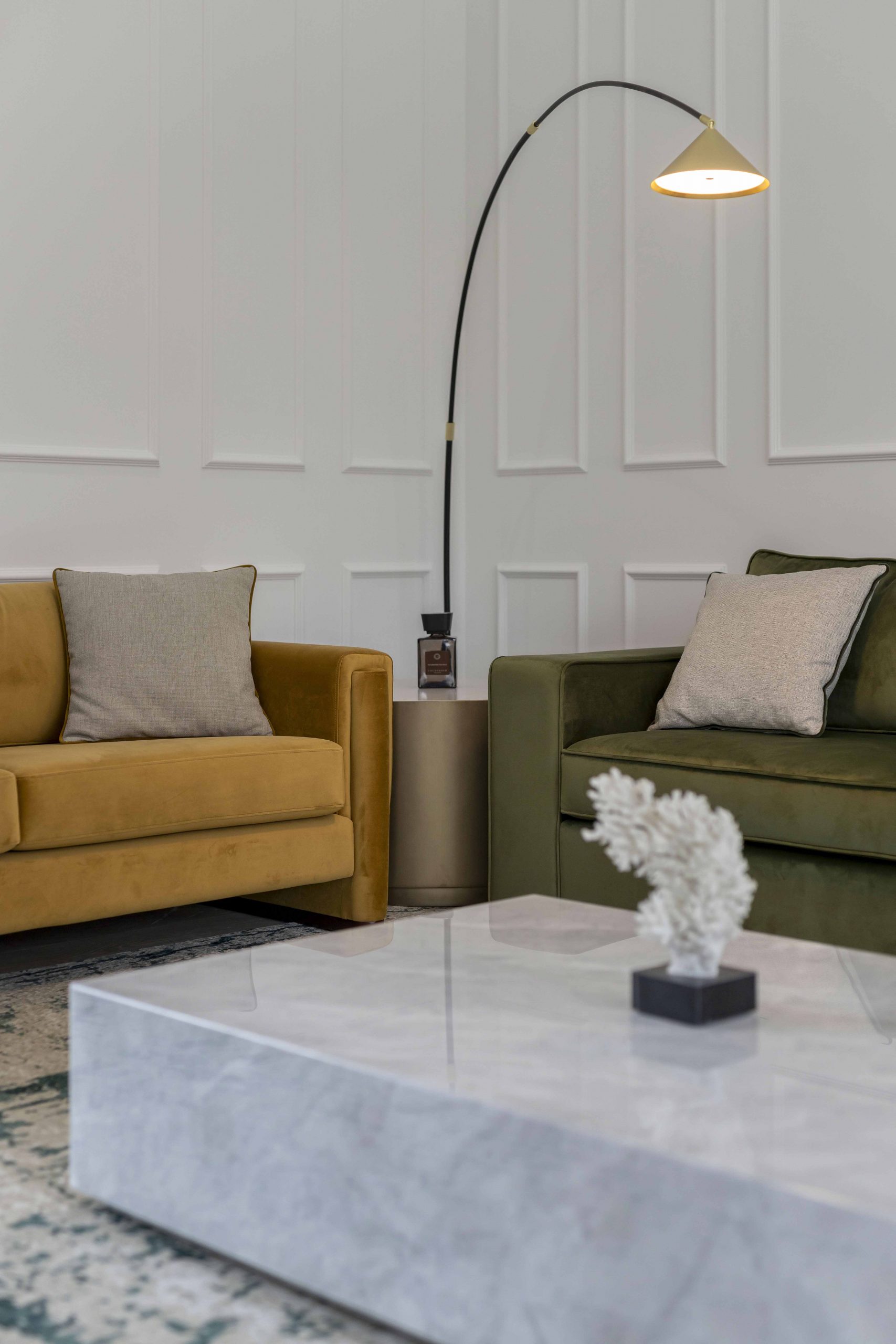
The colour entered with all the energy in this project, from greens and yellows, to geometric patterns and neutral tones, we can see that taking the risk is often worth it. In simplicity, more colourful areas were built, but without being too much. Harmony prevailed.
The textures were a beautiful reinforcement in the composition of the environments, giving body and form to all the pieces, especially to pieces with upholstery, such as chairs, armchairs, sofas, beds and even stools.
Velvet and lined fabric were materials that dominated the rooms throughout the house, always in a dichotomy of neutrals and impactful tones. Walnut was the elected wood to shine in so many sides of this dwelling, either in a dining table, as in all the tv furniture. The concern was to carry quality and safety in every aspect.
Both the layout and the furniture pieces were uncomplicated and practical, emanating a feeling of serenity and happiness.
- Minimalist entrance hall
- Contemporary Living Room
- Modern dining room
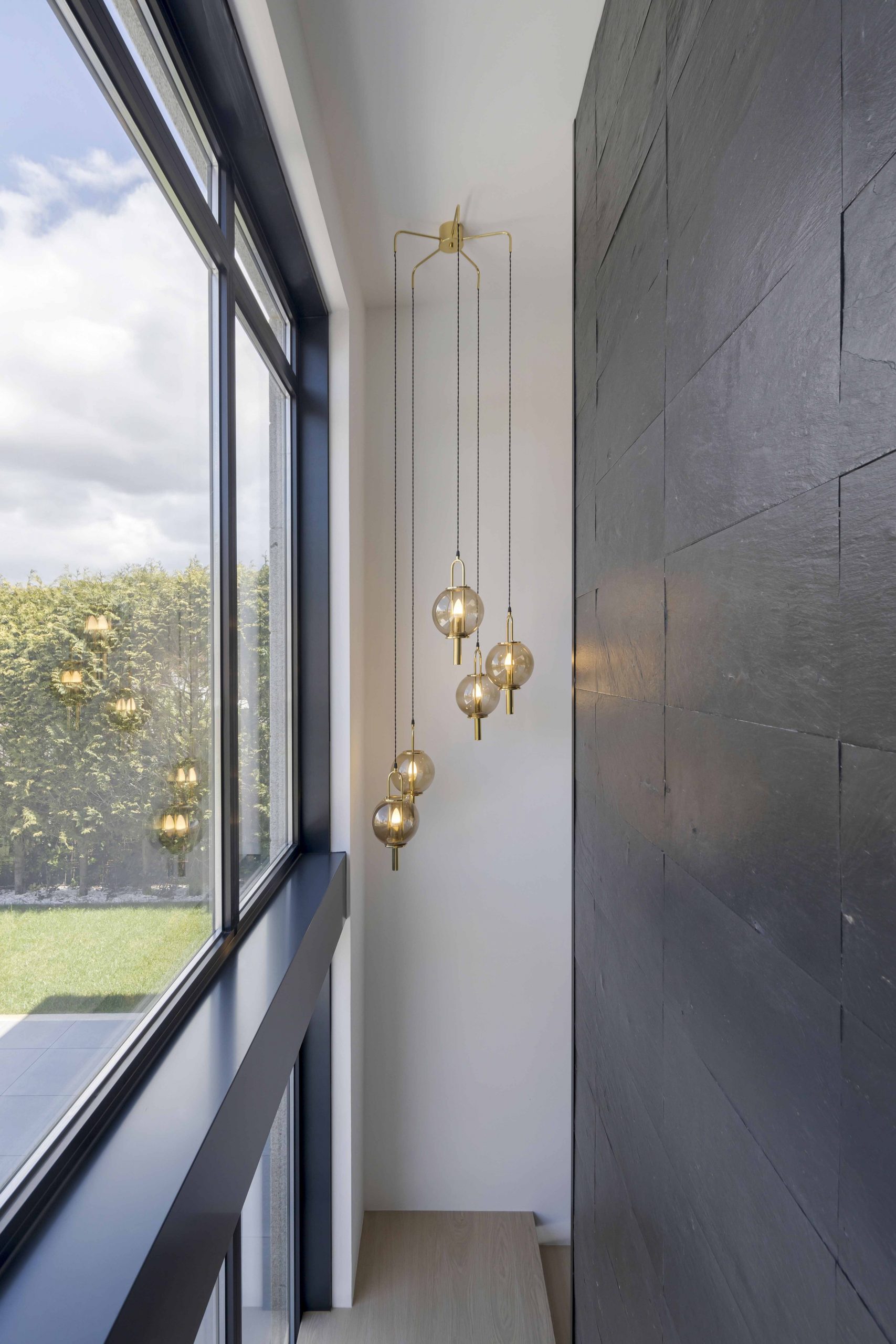
- Staircase with suspended lighting
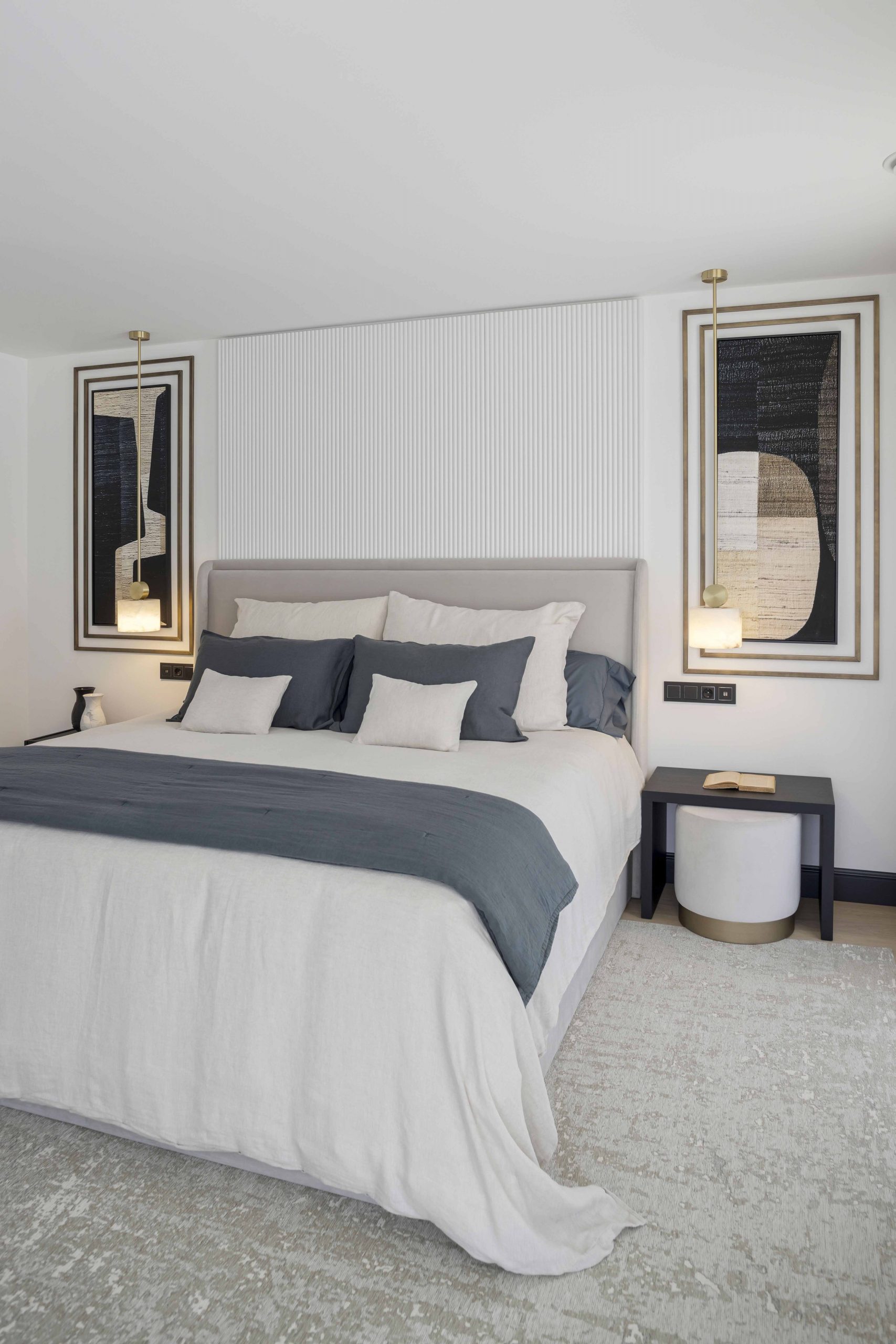
- Minimalist bedroom with ceiling lighting
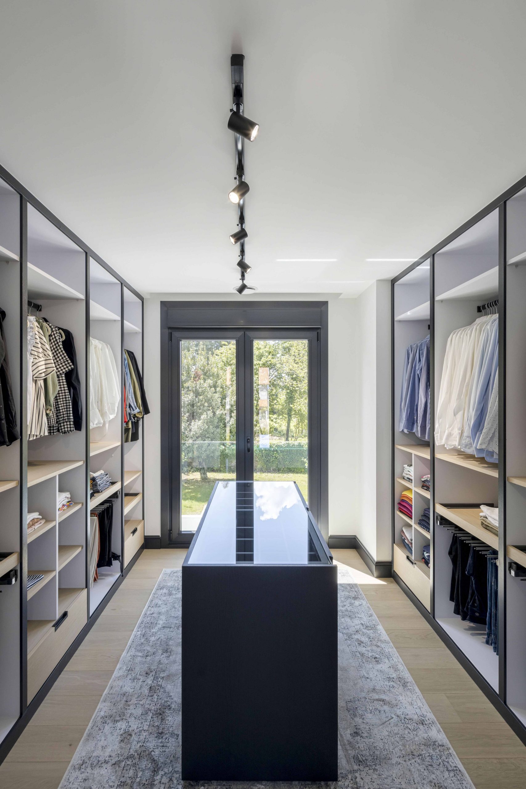
- Wardrobe with natural light
Customised Tv cabinet
An interspacial challenge, this piece of furniture is the representation of the excellent combination between form and function, breaking any kind of barriers between living and dining room. The proposal of this piece was based on the delivery of functionality between both rooms, adding good taste. The ability to hide any kind of electrical installation enhanced this design, allowing this nook to become even more visually attractive.
The entire production process of this piece of furniture required a highly rigorous and demanding design study, carried out in stages. With a view to a final shape, this piece was essentially developed to respond to the client’s need between the dynamics of the two environments.
The first step was the choice of bearings and the way we would machine the rotating axes. After that, we designed the internal skeleton of the piece so that everything would work without any kind of constraint.
The next step was the coating in matte American walnut, allowing us to enjoy the golden tones of the wood itself, composing this piece with a ribbed design that added nobility to the whole piece. Details like the shape of the TV and the ergonomics of the space itself were part of the whole process of production and finishing of this graceful TV furniture.
- Installation completed
- Preparing to install the TV
- Adjustments of the custom tv cabinet
- Tv cabinet installed and completed
Details that made the difference
This project gathered very special particularities. Besides the main protagonist, the tv furniture, the decorative details were different and stood out in different visuals. It was in the patterns, in the choice of materials, in the selection of high quality decorations that this project was to achieve a memorable aesthetic. We leave here some of the details that differentiated this interior design.
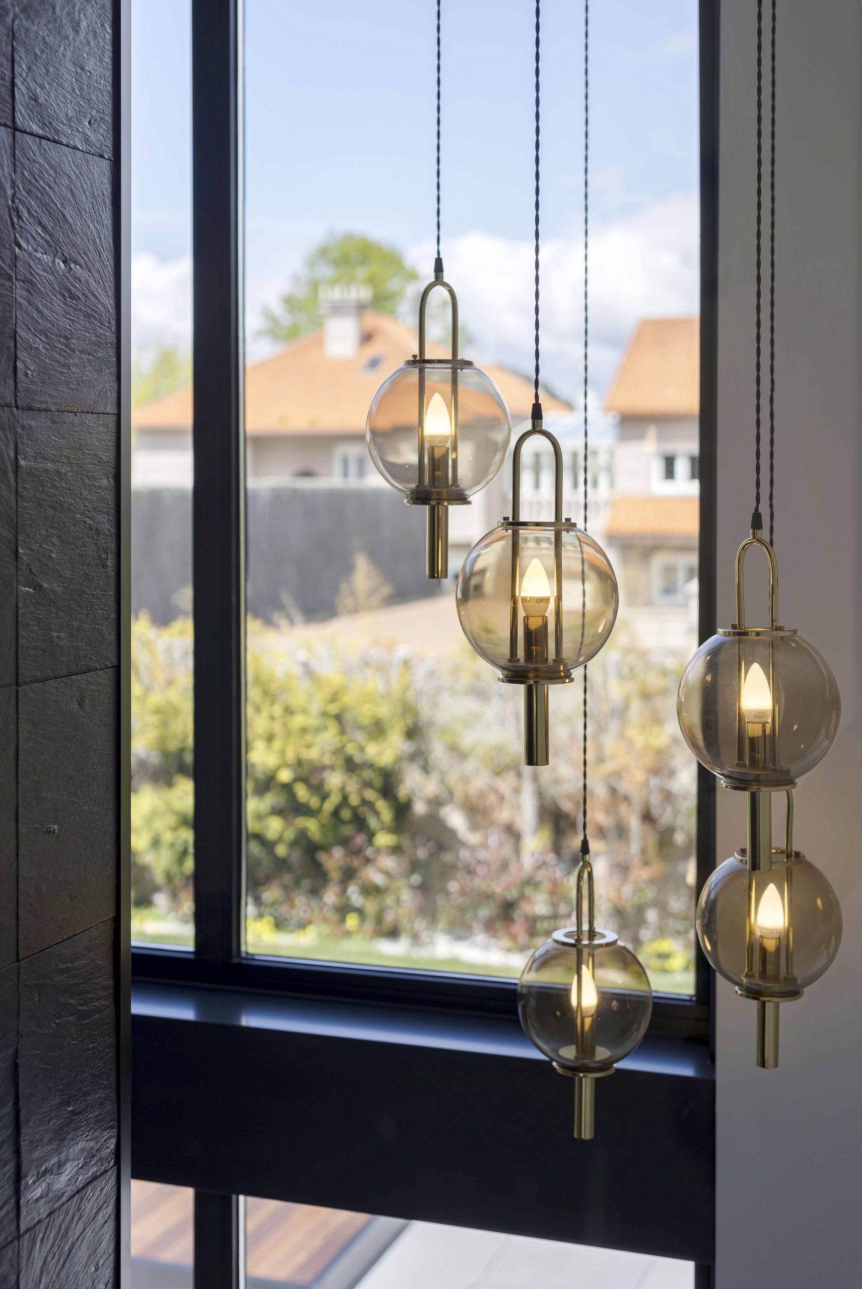
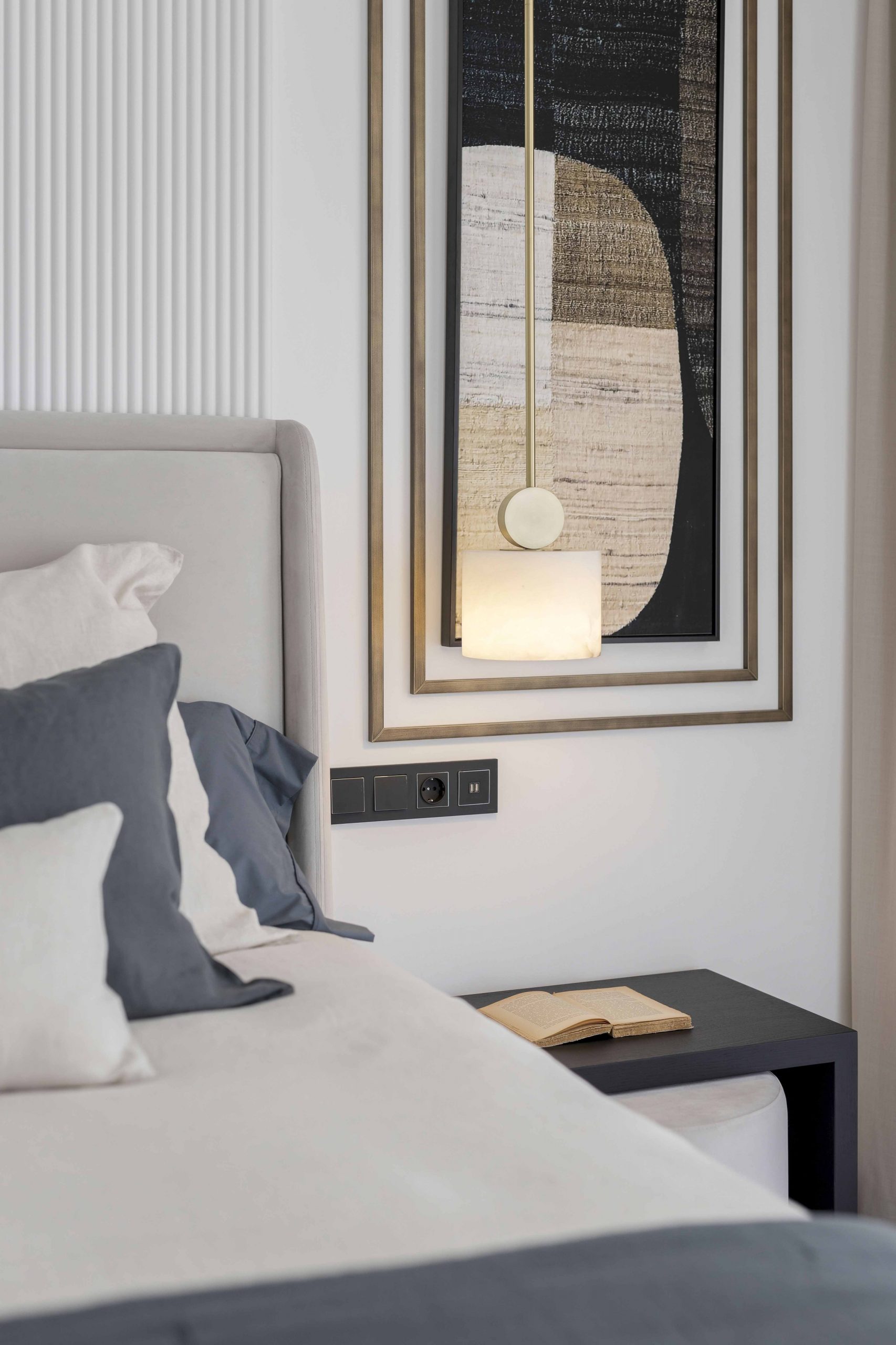
- Points of light
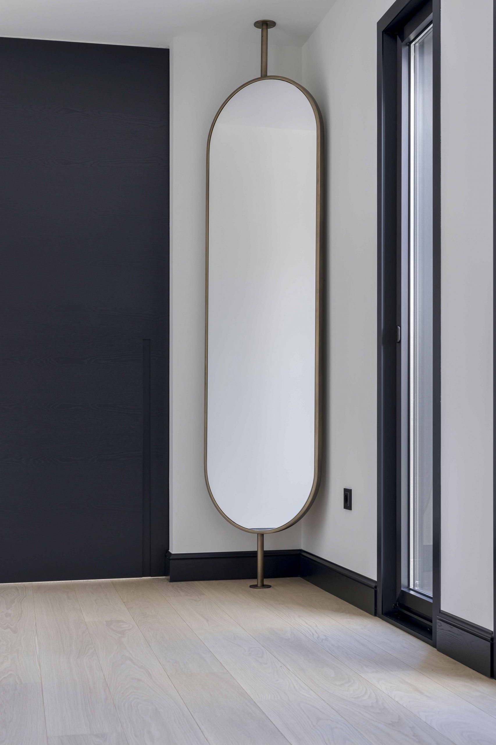
- Vertical mirror in bedroom hallway
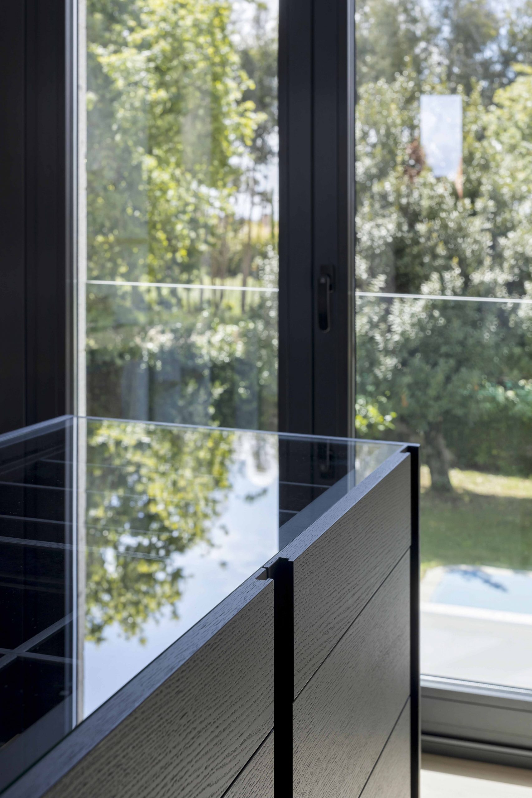
- Details of the Sevilha chest of drawers island
- James and Fortune sofas
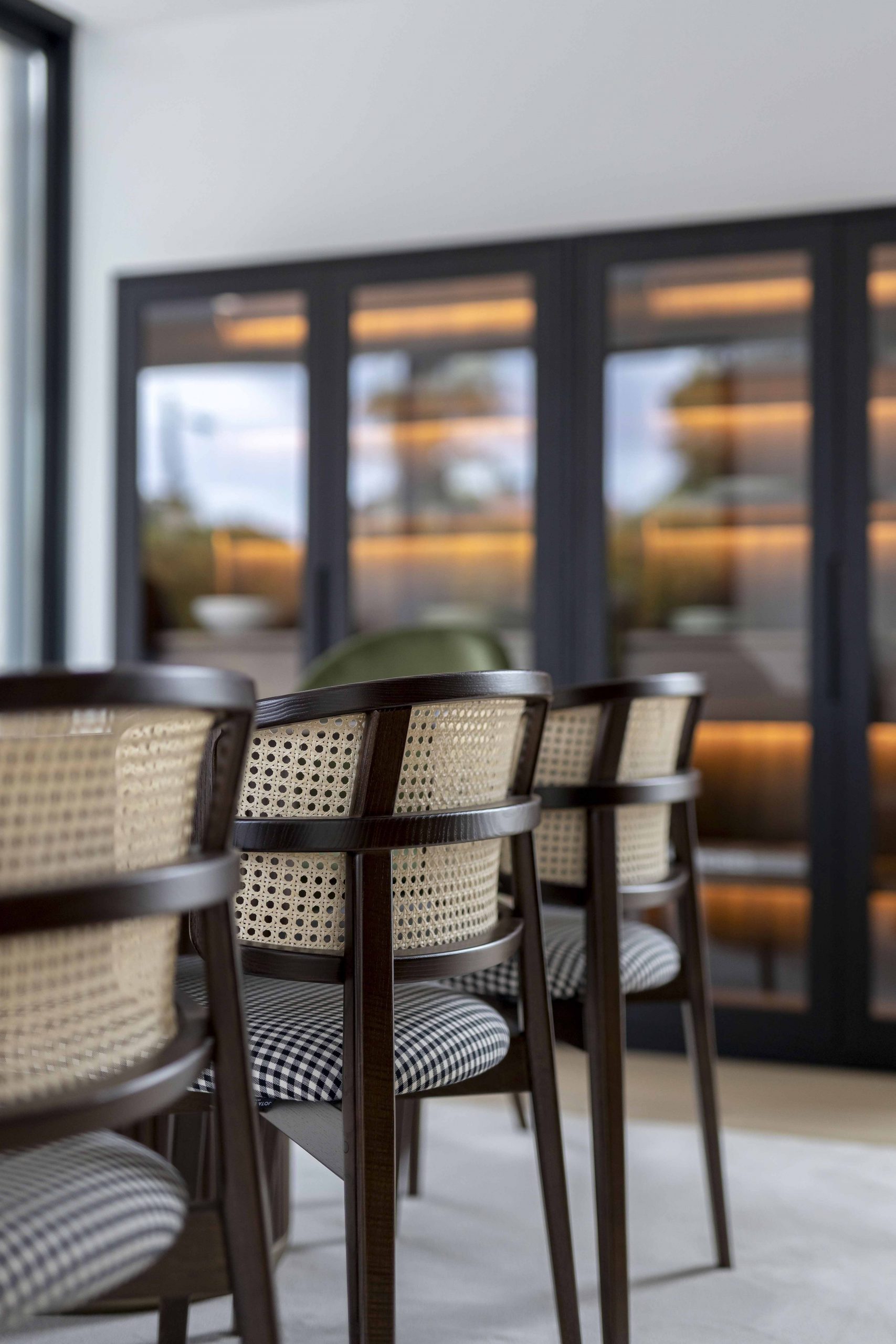
- Coffee Wicker chairs
- Porto Bed and Sublime Puff
