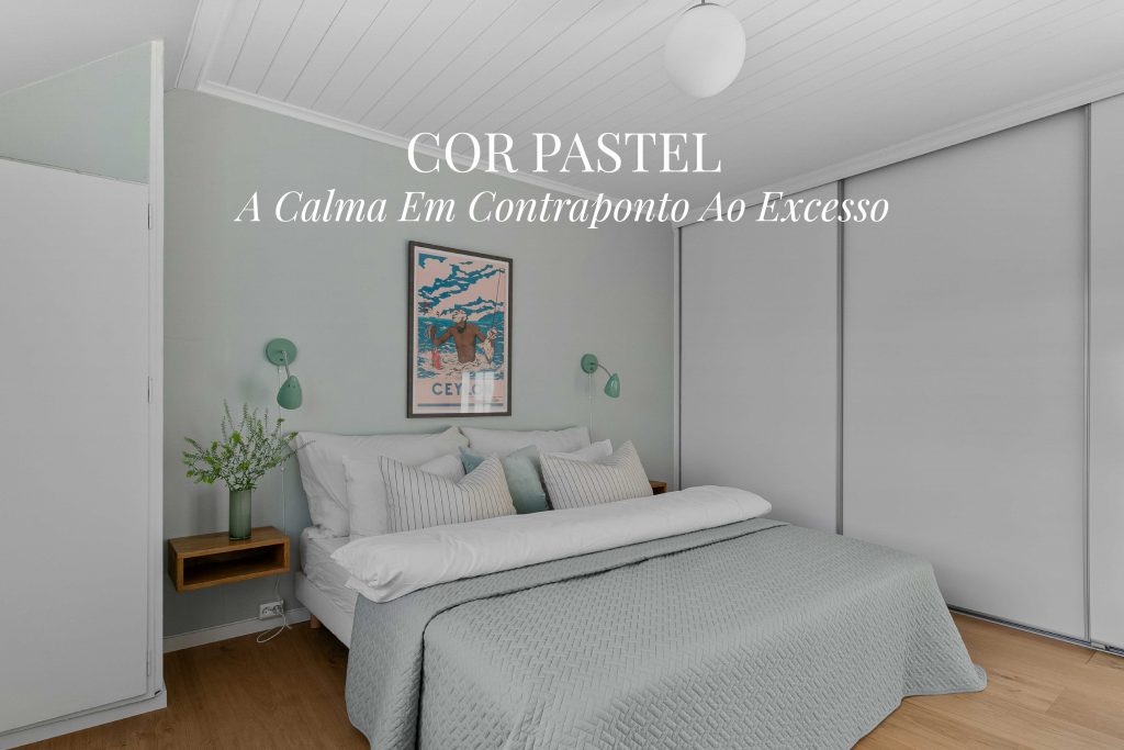
The understated elegance of a pastel color has long been appreciated in interior design. Through periods when these soft hues defined prevailing tastes and others when they seemed to fade into the background, pastels have always found a way to return, almost as a gesture of renewal. Their enduring appeal lies in their ability to balance lightness with sophistication, creating serene interiors without relying on dramatic color.
Their resurgence is particularly evident in spring. As nature regains its vibrancy, pastel tones once again take center stage, bringing with them a sense of freshness and luminosity. In this article, we explore the origins of these delicate shades, their role in contemporary interior design, and the combinations that best express their subtle aesthetic.
Read the full article and discover how a pastel color palette can bring softness and harmony back into your home.
-
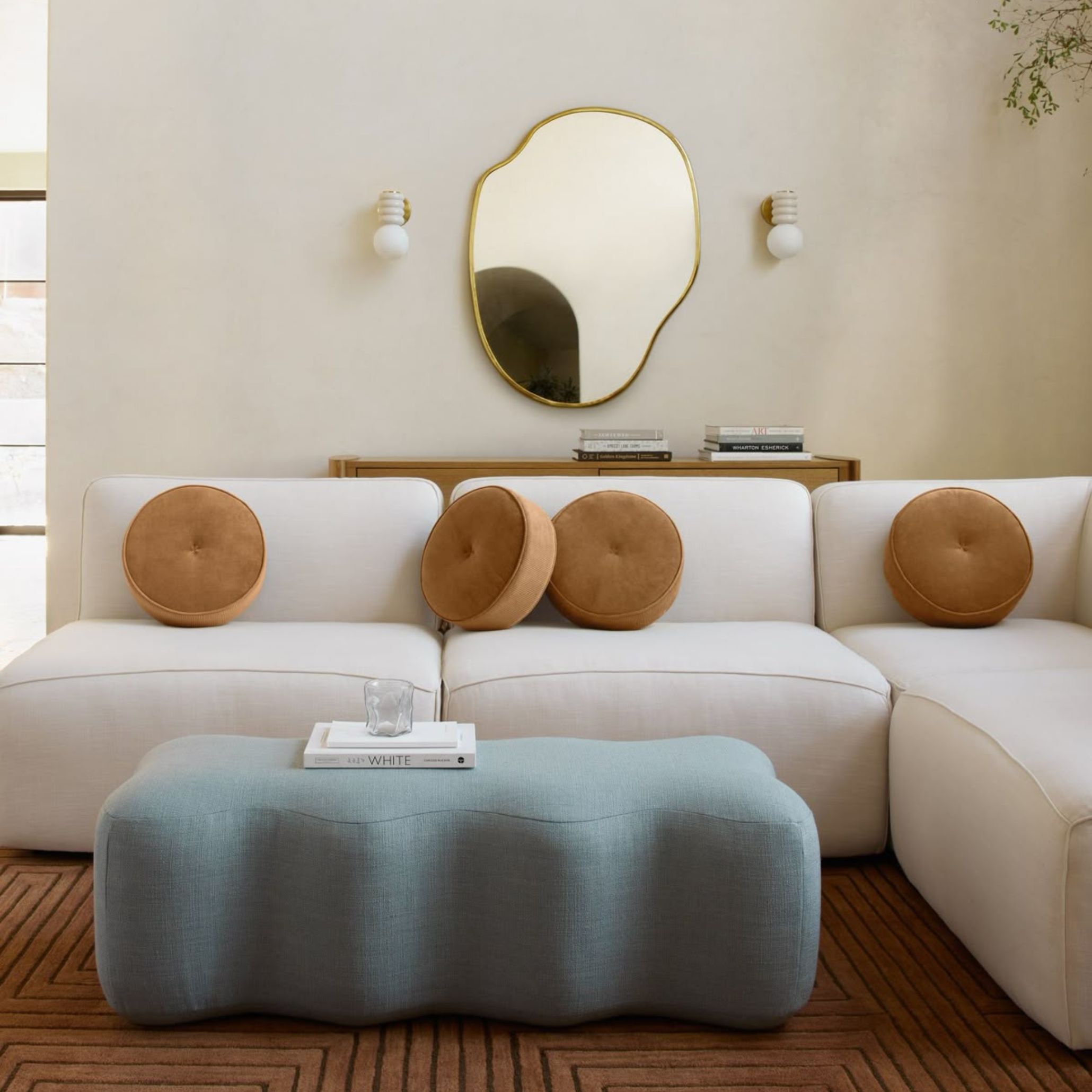
- Leveza e Sofisticação de um Ottoman
-
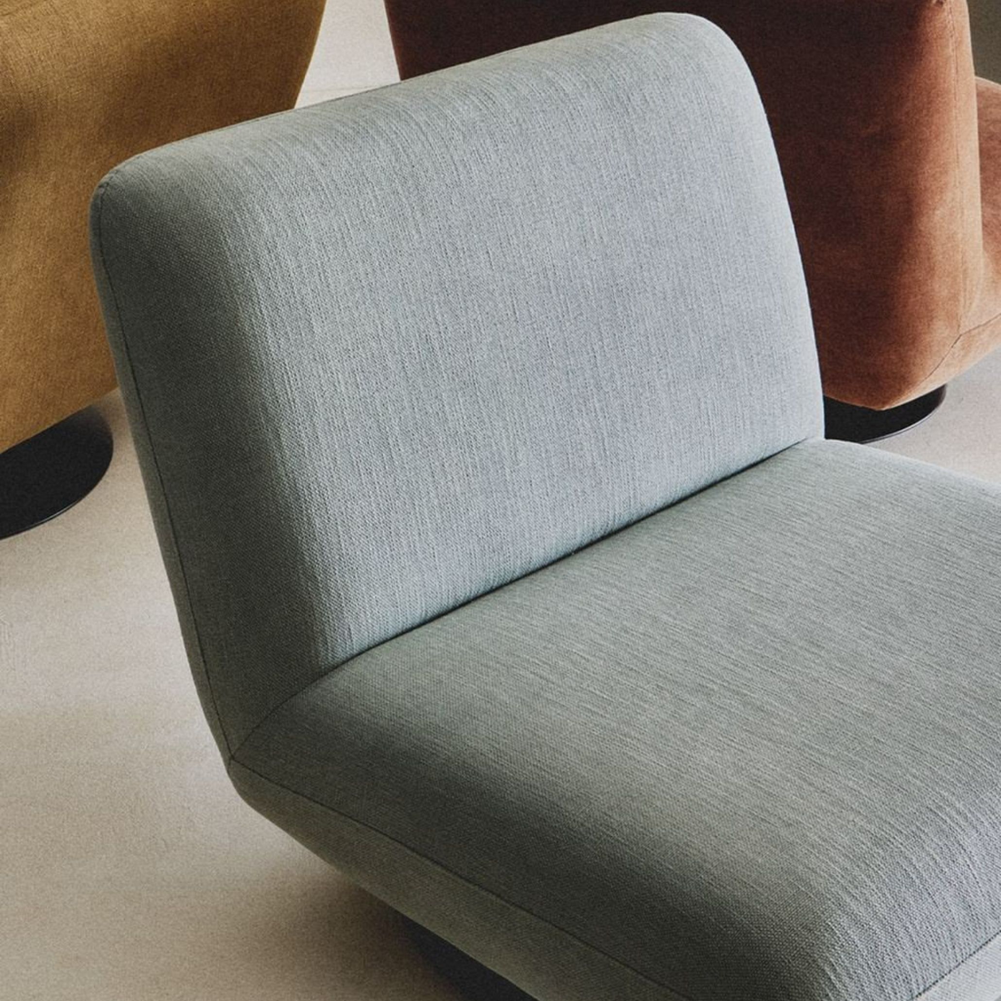
- Cadeirão Azul Pastel | Fonte: Pinterest
Where Do Pastel Colors Come From?
Technically speaking, a pastel color is a lighter, less saturated version of a base color. It is created by increasing brightness and reducing color intensity, typically by adding white or neutral pigments that soften the original hue. In essence, almost any color can become a pastel as long as it is transformed into a lighter, gentler variation.
Pastel color palettes rose to prominence after World War II, becoming symbols of optimism and renewal in interior design. Afterwards, American culture embraced the trend through the iconic pink-and-mint diners and colorful household appliances that defined the 1950s, influencing design movements on both sides of the Atlantic.
-
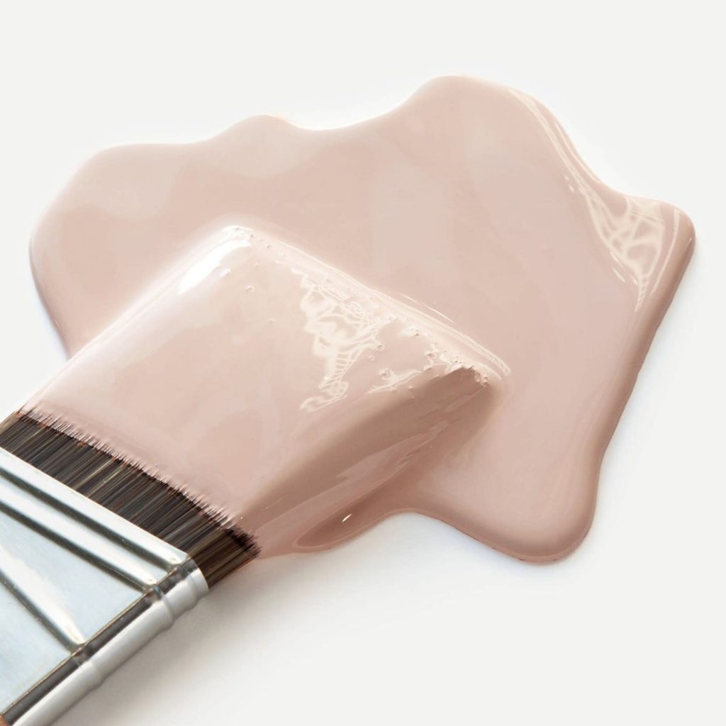
- Cor de Rosa Pastel | Fonte: Pinterest
-
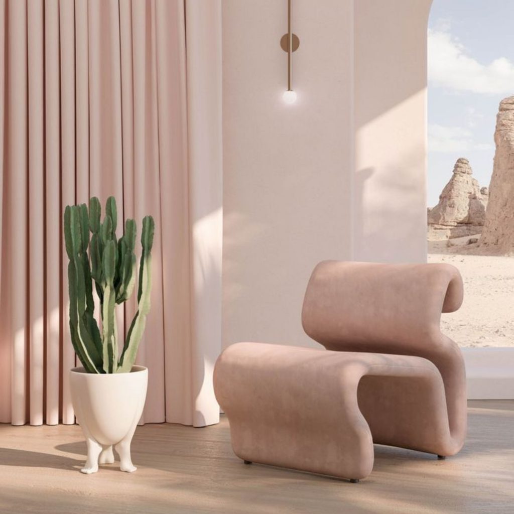
- Ambiente de Cor Pastel | Fonte: Pinterest
How to Create a Pastel Color Palette?
Creating a harmonious pastel color palette begins with understanding how these tones interact with one another and with the surrounding materials in a space. Interior designers often recommend combinations that balance softness with depth. Shades like dusty rose, sky blue, and mint green pair beautifully with warm neutrals, light wood finishes, and metallic accents to create bright, sophisticated interiors.
Creating a harmonious pastel color palette begins with understanding how these tones interact with one another and with the surrounding materials in a space. Interior designers often recommend combinations that balance softness with depth. Shades like dusty rose, sky blue, and mint green pair beautifully with warm neutrals, light wood finishes, and metallic accents to create bright, sophisticated interiors.
Beyond aesthetics, these choices also influence the atmosphere of a space. Pastel colors are often associated with optimism, warmth, romance, and a relaxed, summery feeling. Their low saturation softens the visual experience, helping create interiors that feel calm and emotionally comforting.
-
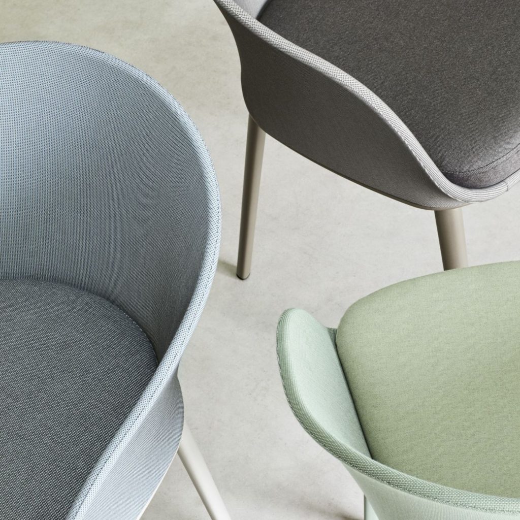
- Paleta de Cores Pastel | Fonte: Pinterest
-
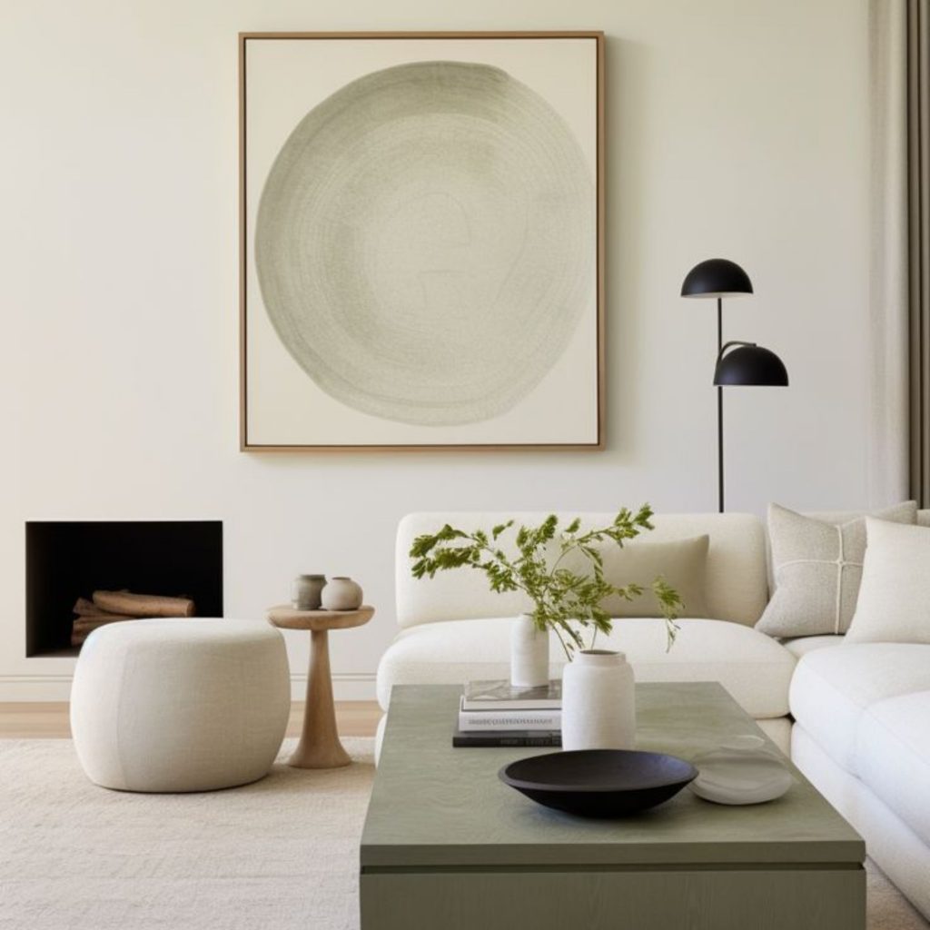
- Variações Cromáticas da Mesma Tonalidade | Fonte: Pinterest
-
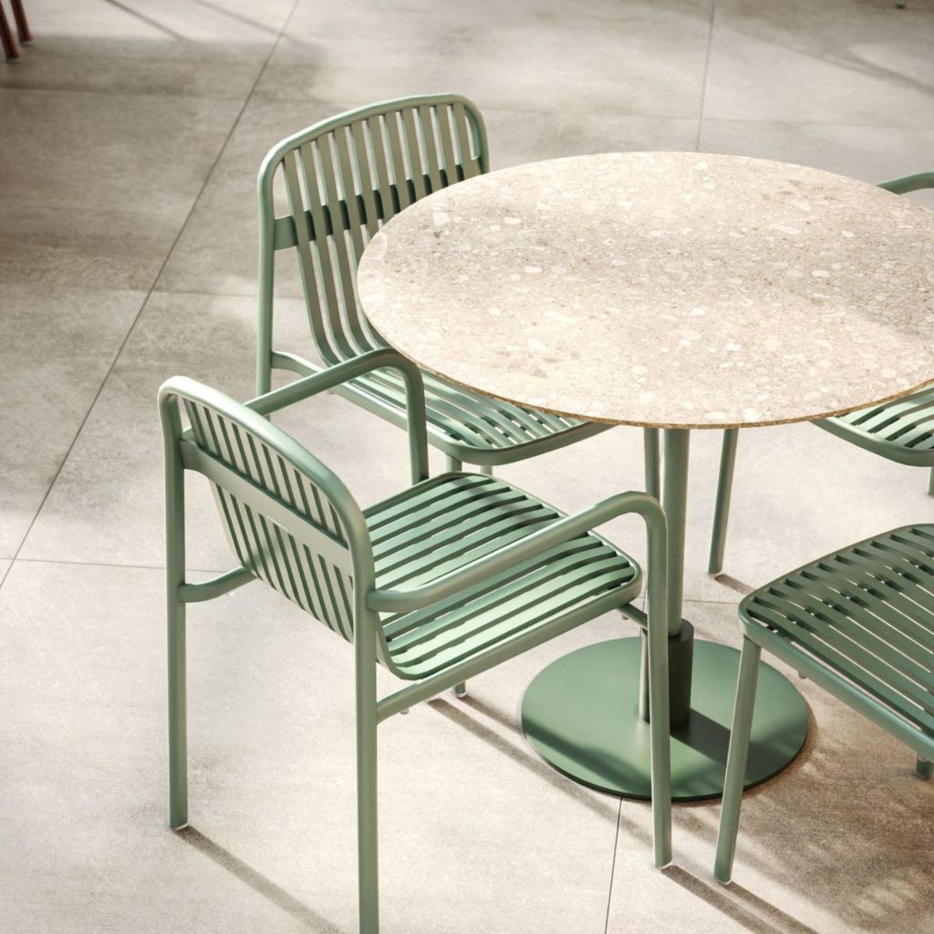
- Ambiente Relaxante | Fonte: Pinterest
The Best Pastel Colors for Interior Design
When selecting colors for your home, a pastel color palette offers remarkable versatility. Many interior designers favor shades such as mist blue, sage green, muted peach, and dusty lavender for their ability to complement a wide variety of design styles. The most successful pastel colors strike a balance between softness and visual presence, brightening a room without feeling overly sweet.
These hues work beautifully throughout the home. Once associated primarily with children’s rooms and nurseries, pastel palettes are now equally at home in living rooms, kitchens, and bathrooms, where they introduce freshness, warmth, and natural light.
A pastel color can be incorporated through painted walls, lacquered furniture, textiles, or decorative accessories, adapting effortlessly to styles ranging from vintage-inspired interiors to contemporary homes.
-
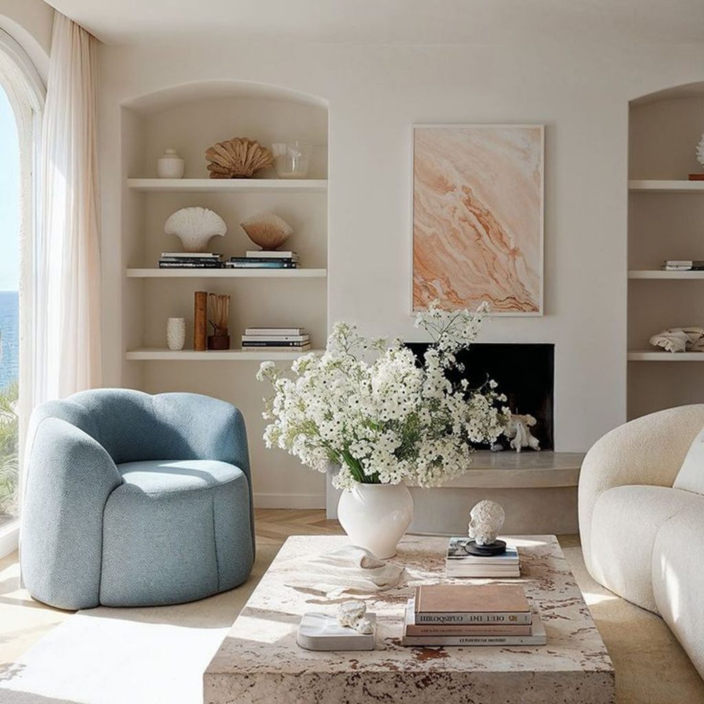
- Tons Pastel Introduzidos na Sala de Estar | Fonte: Pinterest
-
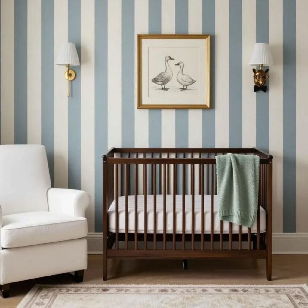
- Berçário Decorado com Cores Pastel | Fonte: Pinterest
Tips for Incorporating a Pastel Color Palette into Your Home
If you’re considering introducing a pastel color palette into your home, keep these design principles in mind:
1. Layer Different Shades of the Same Color
Rather than relying on a single pastel color throughout the room, experiment with multiple shades from the same color family to create depth and sophistication. This technique, often used by Scandinavian and Japanese designers, allows pastel tones to feel dimensional while maintaining their softness.
2. Pair Soft Colors with Strong Materials
Pastel colors become even more compelling when contrasted with materials that have visual weight, such as natural stone with dramatic veining, dark wood, black steel, handcrafted ceramics, or richly textured natural fibers.
3. Let Lighting Reveal the Color
Pastel shades change noticeably throughout the day. Designers recommend testing any pastel color under different lighting conditions and layering ambient, task, and accent lighting to reveal subtle undertones that might otherwise go unnoticed.
-
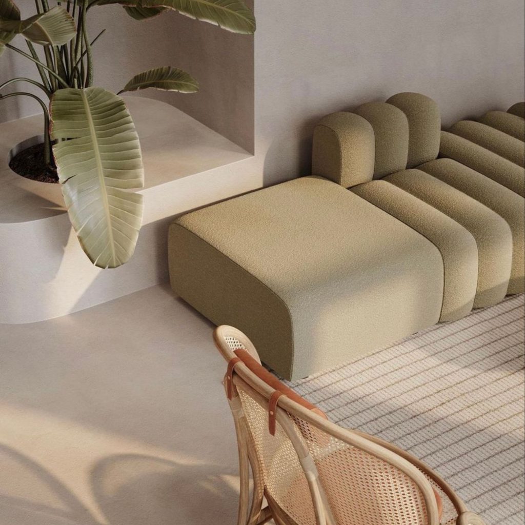
- Verde Suave
-
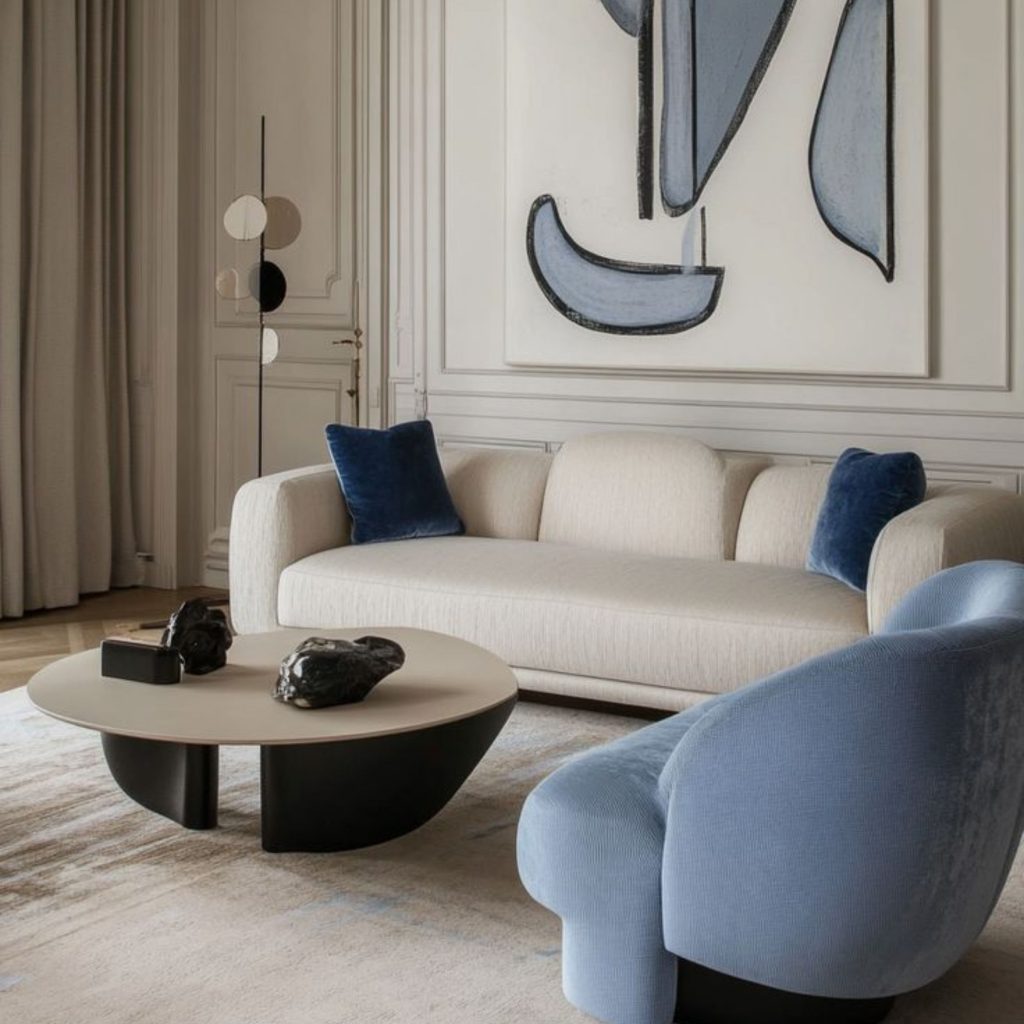
- Diferentes Gradações Tonais | Fonte: Pinterest
-
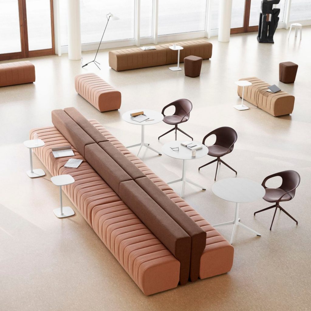
- Influência da Luz nas Cores Pastel | Fonte: Pinterest
More than a recurring trend, introducing a pastel color into an interior is a way of bringing lightness back into a space and, inevitably, into the atmosphere experienced by the people who live there.
Pastel colors remind us that beauty doesn’t have to demand attention to make an impact. By embracing a pastel color palette, we create interiors where light, texture, and materials work together in quiet harmony, resulting in spaces that feel as comforting as they are beautiful.