The psychology of color is present in every space we inhabit, even when we are not consciously aware of it. Have you ever walked into a medical clinic and immediately felt that the atmosphere was cold and impersonal? Or, on the contrary, entered a spa where a sense of relaxation seems to embrace you the moment you step through the door? These impressions are not shaped solely by the purpose of these environments, but by the way they have been designed, beginning with the colors that define them.
The color of the walls, the way natural light falls across a room, and even the most subtle details all have a direct impact on how we perceive a space, often at a subconscious level.
Throughout this article, discover how color can transform the perception of a space and influence the way it is experienced every day.
-
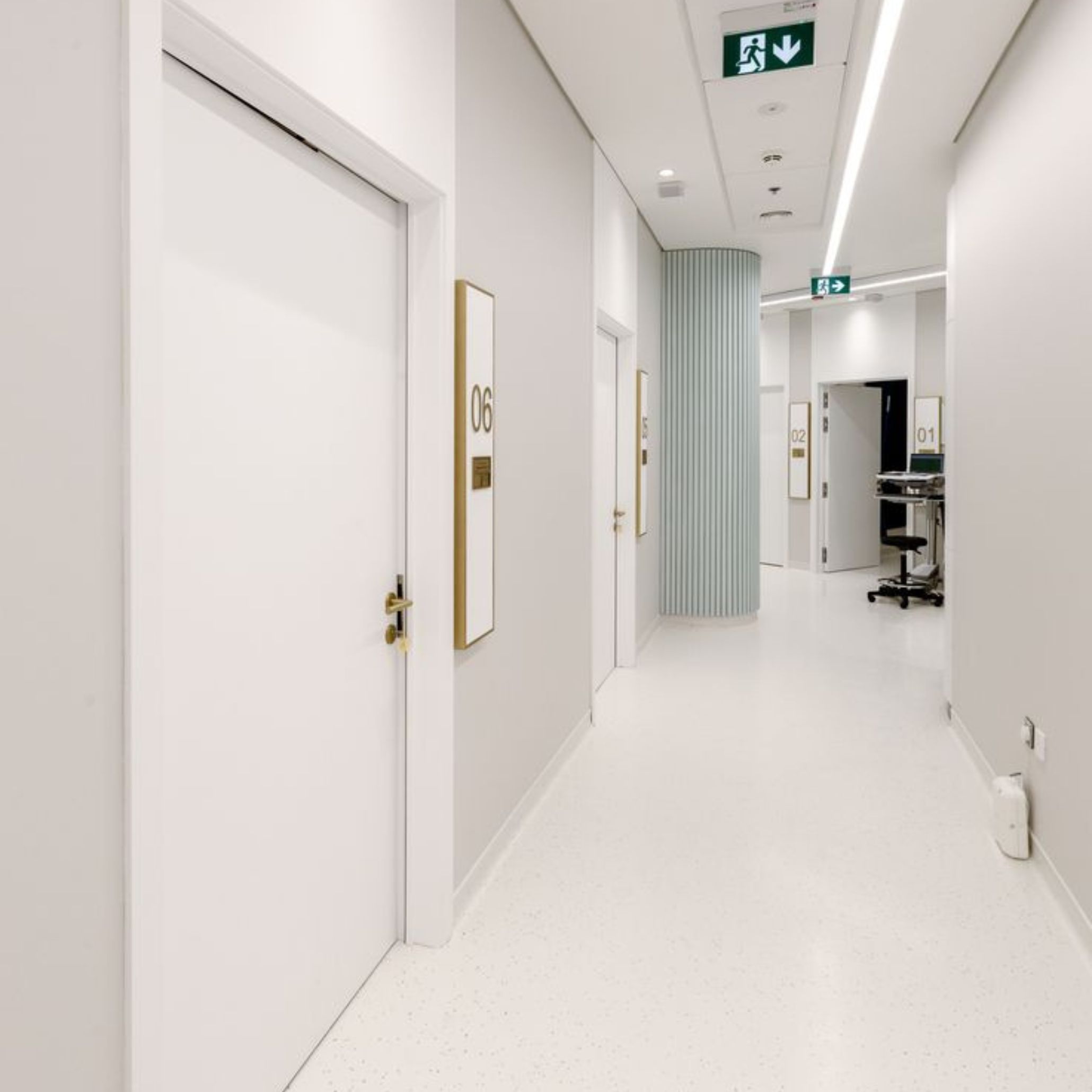
- Ambiente Frio de um Consultório Cliníco | Fonte: Pinterest
-
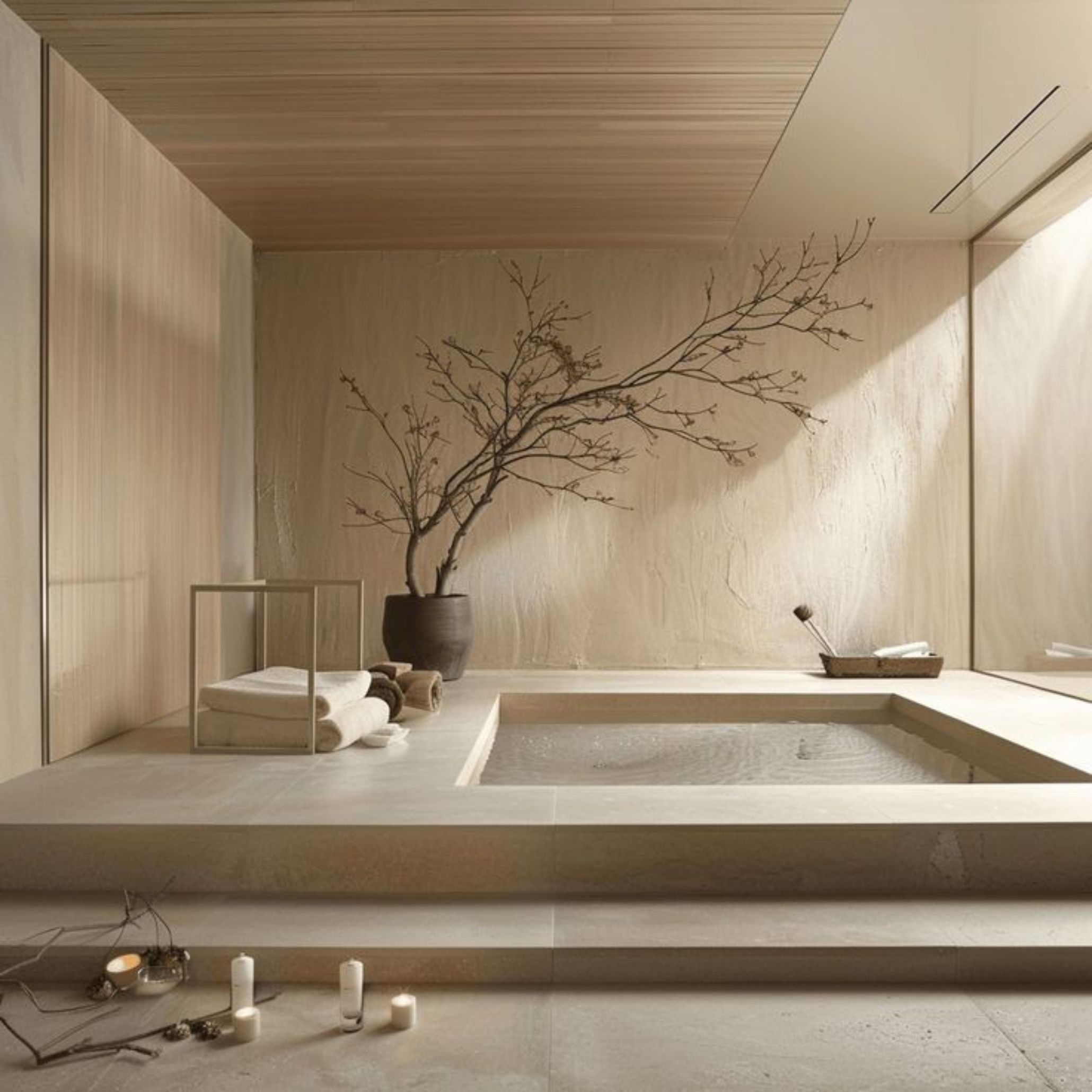
- Um Spá Relaxante | Fonte: Pinterest
What Is the Psychology of Color?
The psychology of color explores how different hues influence our emotions, attention, behavior, and even the way we perceive the spaces around us. Although colors are often associated solely with aesthetic preferences, they have the ability to evoke specific emotional responses, from increasing energy levels to enhancing focus or creating an atmosphere of tranquility. Understanding these effects allows you to use color more intentionally and effectively in everyday life, whether at home, at work, or in spaces dedicated to well-being.
While there are broad universal associations, such as the calmness often linked to blue or the vitality associated with yellow, the way each person responds to color is also shaped by cultural, personal, and contextual factors. In Western cultures, for example, white is often associated with purity and simplicity, whereas in many Asian cultures it symbolizes mourning and farewell.
Research in this field has shown that color can be used strategically to improve performance, support concentration, influence purchasing decisions, and even enhance therapeutic approaches. When applied with knowledge and intention, color becomes far more than a decorative element; it becomes a powerful design tool capable of enriching the experience of every environment.
-
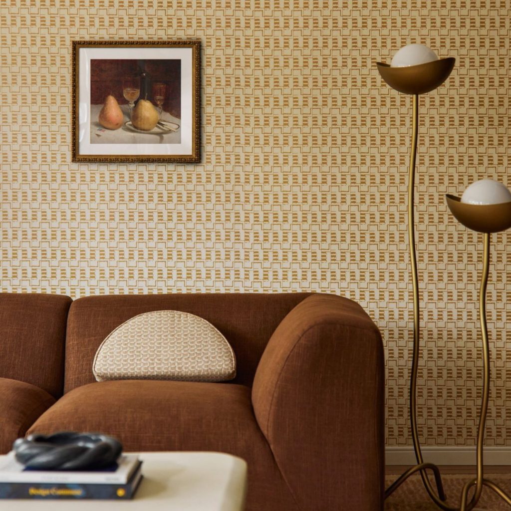
- Uma Sala de Estar com
-
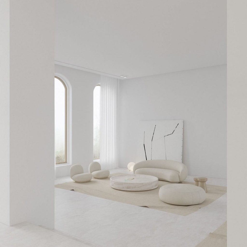
- Ambiente Monocromático que Estimula
The Symbolism of Color in Interior Design
In interior design, the symbolism of color is a natural extension of what the psychology of color reveals: every hue communicates an intention and evokes specific emotions. Primary colors convey clarity and visual impact, while warm tones create a sense of energy and closeness. Cooler shades, such as blues and greens, suggest serenity and balance. This distinction makes it possible to design interiors that respond to the unique needs of each space, whether they require vibrancy or introspection.
Emotional responses to color generally follow widely recognized patterns, but they are always filtered through personal experiences and situational context. Life experiences, aesthetic references, and the environment in which a color is used all influence how it is interpreted. As a result, a tone that conveys comfort in a residential setting may take on a completely different meaning in a workplace, where functionality and concentration become more important.
When used intentionally, color becomes a strategic design tool capable of shaping both private environments, such as the home, and more intuitive and harmonious social spaces.
-
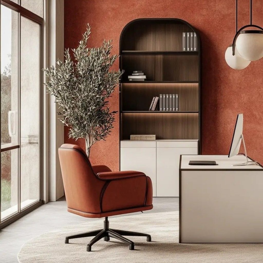
- Um Escritório com Tonalidades Quentes | Fonte: Pinterest
-
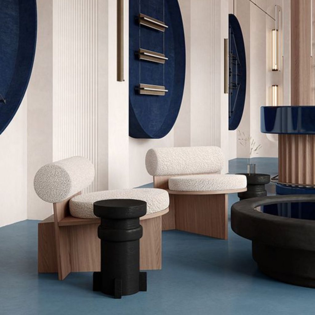
- Equilíbrio e Serenidade das Cores Frias | Fonte: Pinterest
Color Relationships | How to Create Elegant Color Palettes
Color relationships form the foundation of balanced and functional palettes. However, selecting the right colors for an interior requires considering not only aesthetics but also the emotional responses they evoke and the factors that shape individual preferences.
Creating color palettes that work in real-life settings means looking beyond the color wheel and understanding how colors behave within a physical space. Natural light, solar orientation, surrounding materials, and even surface textures subtly alter the way a color is perceived. A shade that appears perfectly balanced on a screen may feel too cool in a north-facing room or overly vibrant when applied to a large, sunlit wall. For this reason, testing samples at different times of day and alongside the actual materials is essential to ensure that a palette performs as beautifully in practice as it does in theory.
Once these factors are understood, selecting harmonious combinations becomes far more intuitive. Pairing warm, earthy tones with soft neutrals remains one of the most reliable ways to create balanced and versatile interiors. Within cooler palettes, combining blues, greys, and muted greens with natural materials helps preserve freshness and lightness without compromising visual comfort.
-
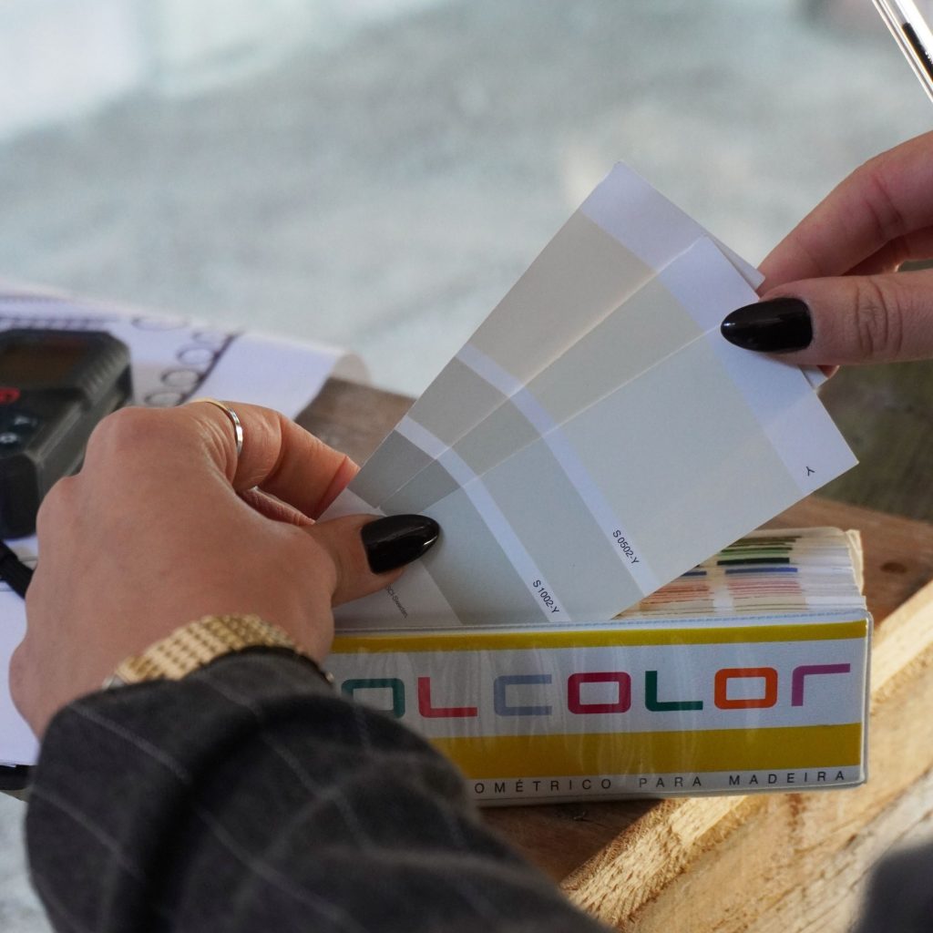
- Criação de Paletas Equilibradas e Funcionais
-
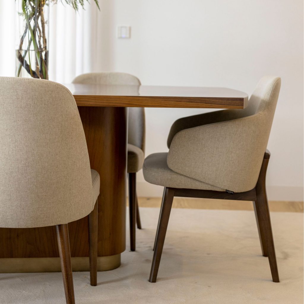
- Comportamento das Cores no Espaço físisco
In interior design, understanding the psychology of color means looking beyond immediate visual impact and recognizing the subtle influence that every hue can have on everyday life.
Color is never just a detail. Even when it appears understated, it shapes the atmosphere of a space and quietly influences the relationship we build with it over time. Choosing between different colors should therefore never be seen as a purely decorative decision but as an expression of sensitivity, intention, and thoughtful design.